Member-only story
Visualize Your Medium Stats With Svelte and JavaScript
Build 5 chart examples to analyze your Medium writing

The numbers explain the reality, but sometimes they are not clear. Series and reports are powerful but not always understandable tools. For this reason, it is often convenient to add a graphic to your pages. But how to do it? Well, today I try to explain the simplest way I have found to add charts to a web page.
Introduction
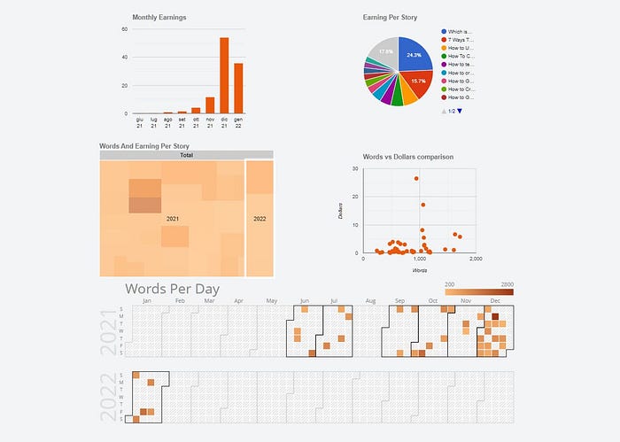
Before, here’s what I want to create:

There are 5 different charts but the procedure is very similar:
- a column chart
- a pie chart
- a treemap chart
- a scatter plot
- a calendar chart
In this tutorial, I will be using data from the Medium Partner Program. I already used them a few days ago when I talked about how to create responsive tables with CSS.
To see how to download and import statistics check out my post:
However, in summary, just go to medium.com/me/stats?format=json&count=100 and download the page. Of course, I can create graphs with any data, but to remind me of the process in the future I need some sample data.
The toolbox
What do I need to easily create graphics with JavaScript, HTML and CSS? On the web, you can find various libraries. The simplest one, in my opinion, is Google Charts. As you can easily guess from the name, it is a Google library. Google defines it like this:
Google Charts provides a perfect way to visualize data on your websiteThe quickstart page explains how to create a pie chart. It is a good starting point but it is not the path I intend to follow. There is an easier way.

