Member-only story
How To Create Responsive Data Tables With CSS Grid
Create your own Medium stats and earnings analysis tool

Tables are quite a complicated thing. They have existed since the dawn of HTML and they bring with them some serious problems. They are great for showing little data but rather complicated when the data grows.
I had to investigate this for a recent project of mine (related to how to use Medium stats. The solution I have chosen involves the use of CSS and the Grid Layout Module. Here are my passages and my arguments.
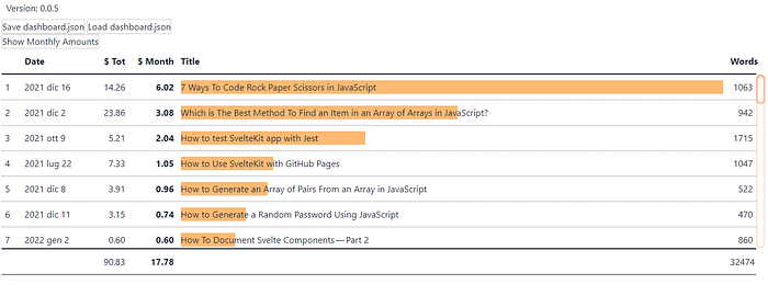
But before starting an image with the result I want to achieve:

Introduction
The first step is to look for what already exists. There are some interesting articles worth reading:
- Responsive data tables with CSS Grid
- How to create responsive tables with pure CSS using Grid Layout Module
- Really Responsive Tables using CSS3 Flexbox
From this I started to think about how to create my table.
First, of course, I need the data. I decided not to use fictional data for this article simply because the best way to learn is by solving a real problem. My problem is: I have some stats regarding my earnings on Medium. How can I analyze them?
But I won’t talk about the data itself. For the moment I just need to know how they are organized. And I decided to organize them into an array, listStories. Each element of this array is an object composed of these properties:
I don’t care about showing every single property. And I’m interested in having an easy way to decide which ones to view and order. To do this I need another array, this time made up of objects composed like this:

