How to Implement Star Rating Widget With React.js and Optimize It
Designing it from start to finish

In this article, I want to cover the problem you can have in an interview for the frontend position — implementing the star rating widget.
I had 15 onsite interviews in the last five months and had offers from Google, Roku, Microsoft, and others.
You should clarify requirements and implement that widget for ~45–50 min.
Requirements
Let’s start with the requirements of our widget.
- Displaying stars with dynamic count
- Users can choose a rating
- Allow read-only mode for displaying ratings of other users without editing
- Change the label for the widget
- Change colors of start for empty and filled states
- Extend set and hover events
- Set size of stars
Mockup

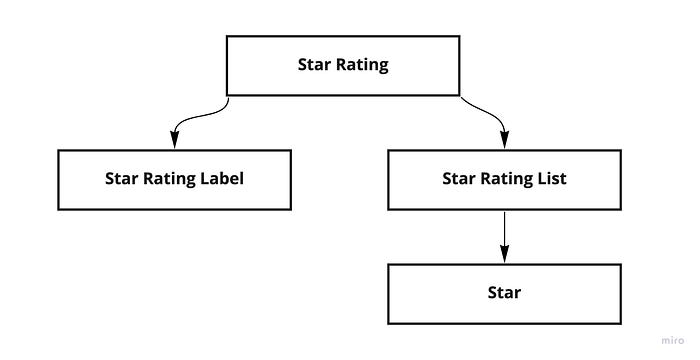
Component architecture

Components implementation
Let’s start with the props of our start rating component. With that props, we can configure our slider.
In the Star Rating component, we need to implement the following:
- Extend set and hover functions for customer needs
- Provide all configuration of the widget in
Context - Render
LabelandStarsList
We will save the current rating and hover values in the component’s local state. To avoid the count of props and drilling, I suggest using Context to provide configuration and current widget state.
setRatingFn and setHoverFn extends events with custom functions and provide current values. In read-only mode, these methods are disabled.
For the label, we have a default function with custom text. If a user wants to use the custom text, we allow them to do that and use that method in the StarRatingLabel component in the render.
StarsList component render count of Star components from the configuration. The default value is five.
Each Star component knows its own value, and we can use that value for a set rating or display changes on hover. Using SVG allows controlling colors, size, and shapes of icons. If you want to provide the possibility to use other icons, users can set custom SVG in configuration. Also, SVG allows changing size without losing the quality of the image.
Another approach can be using custom fonts, in the case you provide different icons for widgets.
Optimization
As you can see in the Star component, each time crating inline function, we can avoid that.
Let's change our Star component code. Need to add data attribute with value for the star and call onClick, onMouseEnter, and onMouseLeave methods without inline functions.
In the Star Rating component changed two methods: setRatingFn and setHoverFn. Here we can get value from the data attribute and use it.
With the OnmouseLeave event, we need to set the hover state to null. We can handle that by typing or creating a separate method and calling it.
One more approach can be using radio buttons and getting values from them.
Conclusion
Now you know how to create a custom star rating widget and what the requirements you can clarify with the interviewer.
All code you can see on GitHub.
Other articles you can read:
Want to Read More About Front-End Interviews??Here's my blog
Good luck with your interviews!

