Build the Apple Calculator in SwiftUI
Part 1 — The View

In this tutorial series, we are going to build the Apple Calculator from scratch. This Calculator will be developed with the best practices in mind. If you are a beginner, that’s great, as you’ll start learning some new challenging concepts that will make you a better developer. If you are intermediate, this tutorial will help you grasp some important practices for building scalable and maintainable SwiftUI apps.
In this tutorial, we will start by building the view.
The view is one of the most important parts of your app as the view is what the user sees and interacts with. The view is also the part of your code most likely to change over time, so building a well-structured view is essential for maintainability.
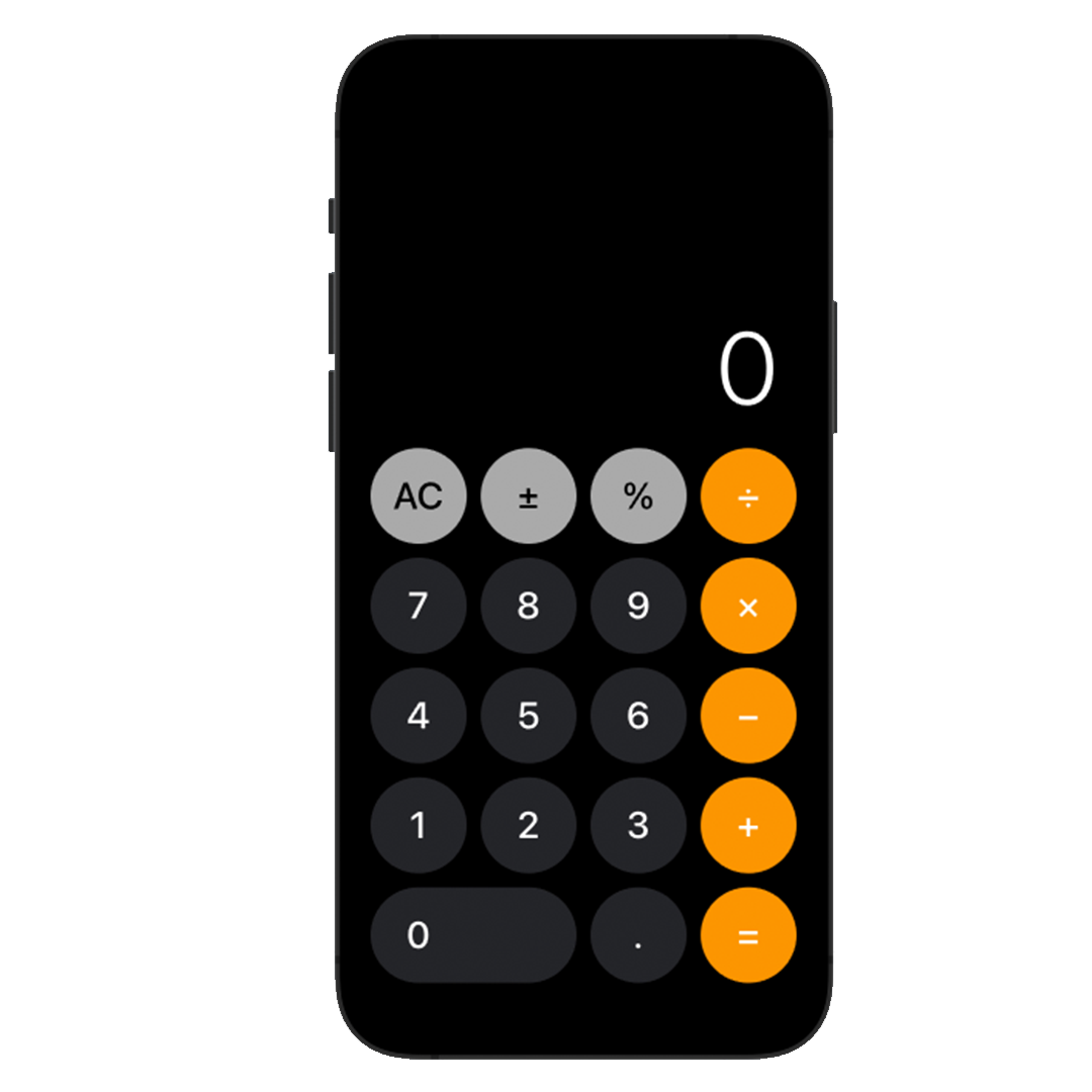
We will recreate, as close as we can, the Apple Calculator, following some of the best practices to organize and maintain our views.
Create a New Project
Create a new iOS app.

Enter Calculator for Product Name and make sure you select SwiftUI as your Interface. Uncheck all the boxes at the bottom, we won’t need those functionalities for now.

Plan Your View
Okay great! We have our project, let’s get coding. But wait! How can we start coding, if we do not know what we are going to build?
I cannot stress this enough. Before building anything, plan.
When building views make sure you have some sort of reference to work with for what you are going to build. This can be anything from a poorly drawn sketch to a pixel-perfect mockup. Anything that you can go back to and look at and give you an idea of what the result should look like is good.

Fortunately, we are not designing our views from scratch, as we are building a recreation of an already existing app (for educational purposes). We can just open the calculator app on our iOS devices to look at the reference.
Okay, so now we need to start thinking about how to lay our views before writing any code.
Deconstructing a View
This step is essential for planning and knowing how we are going to implement our view in code.
The objective is to break down the view into just simple components.
When deconstructing a big complex view, always try to think of everything as a container. Start from the outside (general groupings) and slowly work your way inside until you get to the simple components.

Remember, there are a thousand ways of implementing a view. This is my implementation, of what I thought was the simplest way to go about it.
So, going back to what I mentioned earlier about deconstructing the view — At the outermost layer, the CalculatorView, we can visualize a VStack which contains 3 components.

The Spacer and DisplayText are already deconstructed to their simplest form (A Spacer and a Text), however, the button pad has a lot of extra complexity we need to deconstruct. — Let’s see what we can come up with.
Focus only on the ButtonPad as if it is the only view that exists. This is a very important engineering principle; breaking problems into more digestible subproblems. We are going to be applying this principle throughout the series.
We can see now, another VStack (this one has smaller spacing than its parent) which contains multiple stack views. Each HStack contains 3 or 4 Button views. Button is the simplest form we can go so we are done!

We have fully deconstructed Apple’s Calculator view.

Let’s Get Coding
Perfect, we have successfully deconstructed the view, and we now have an idea of what the implementation will look like.
We will now start constructing the view.
Constructing a View
Constructing a view is no longer part of the planning phase. — We are now building the actual app.
To construct a complex view, we will apply the same principle of breaking the problem into smaller, more digestible subproblems. You can start from the innermost layer and work your way out, or you can start from the outermost layer and work your way in.
I like using a combination of both as it gives me the big picture while at the same time allowing me to focus on the smaller details.
Create CalculatorView
Create a new SwiftUI View and save it as CalculatorView


We will be using CalculatorView as our main view, so go ahead and delete ContentView.

In the CalculatorApp file, change the lineContentView() to CalculatorView()
We’ll start by creating the outermost VStack in its simplest form.
Add a VStack with a Spacer and a Text view. — We will worry about the ButtonPad later.

We are trying to break the problem into smaller subproblems. For our next objective, we are going to design the displayText. First, change the background color.
Add .background(Color.black) modifier to the VStack.

You’ll see our view now contains a strange line. We’ll fix that but first, the background color is the same as our displayText, so we can no longer see it.
Add the following modifier under Text(“0”):
.foregroundColor(.white)
The VStack is skinny because Text does not have the full-screen width. Let’s make the Text frame occupy the whole screen width and make sure that the text prioritizes its position to the right (.trailing = right, .leading = left).
Add the following modifier to Text:
.frame(maxWidth: .infinity, alignment: .trailing)
Perfect! We are getting close. The layout for the displayText is almost done. However, the font does not look anything like the final product. Let’s update the font.
Add the following modifier to Text:
.font(.system(size: 88, weight: .light))
Now, notice how in the real calculator app, the text shrinks when displaying large numbers? That’s another modifier called minimumScaleFactor. It shrinks the view if necessary, and you can set the limit of how much small the view can get.

By default, if the Text gets to its width limit, it will automatically occupy the next line. We want to limit the displayText to 1 line so we can shrink the text. The lineLimit modifier lets us do exactly that.
Add the following modifiers to Text:
.lineLimit(1).minimumScaleFactor(0.2)

Finally, add .padding() as the first modifier and we are finished with the displayText.
Important: Remember modifiers are applied in order, so the order does matter.
Here’s the complete example code up until now.

Create the Calculator Buttons
We are now going to start creating the ButtonPad.
Going back to the deconstruction of our view, for the ButtonPad we have a VStack, which contains 5 HStack views which have 3 to 4 Button views.

That gives us a total of 19 buttons. We are not going to explicitly code 19 unique buttons for the calculator. We would have to set a custom title, foreground color, background color, and width for each one! What a waste of time.
The solution? — Enums.
ButtonType model
We’ll create a ButtonType enum to do 4 things.
- Differentiate one button from another. (duh…)
- Get its corresponding button text
- Get its corresponding foreground color
- Get its corresponding background color
Create a new Swift File named ButtonType.swift and add an enum named ButtonType. Add all the button types you see on the screen as possible cases.
Now is a great time to start structuring our project.
Create a new group named Models and move ButtonType in. Create another group named Views and move CalculatorView in.

We now have all the ButtonType possible cases. However, we can do better. Let’s simplify by grouping some of these cases.
There are 10 cases for digits (.zero, .one, .two… .nine) and there are 4 cases for arithmetic operations (.addition, .subtraction, .multiplication and .division).
It’s a good idea to group these cases into their own enums as they share similarities in both functionality (ex: digits can be combined to create numbers) and design (ex: digits have a gray background).
Inside the Models group, create a new Swift File named Digit and another named ArithmeticOperation.

For Digit create an enum and pass all the corresponding cases. We’ll make this enum of type Int as it will let us get its value by using its rawValue property.
Make it conform to the CaseIterable protocol so we can easily be able to get an ordered array of all cases using its property Digit.allCases.
Make it conform to the CustomStringConvertible. This protocol requires you to add description property. We will use this as our button text.
Here’s the code:
Similarly, create an ArithmeticOperation enum and add the following code.
By going back to our ButtonType enum, we can now encapsulate plenty of our cases.
Add digit and operation cases with their corresponding enum as an associated value.
We are almost done with our models!
Make ButtonType conform to the Hashable protocol. This protocol will let us iterate over an array of ButtonTypes later on.
Make it conform to the theCustomStringConvertible protocol here as well. We will use the description property to show the corresponding button text as stated earlier.
We now have a text description to show for all different ButtonTypes. However, we are missing a way to get corresponding background and foreground colors.
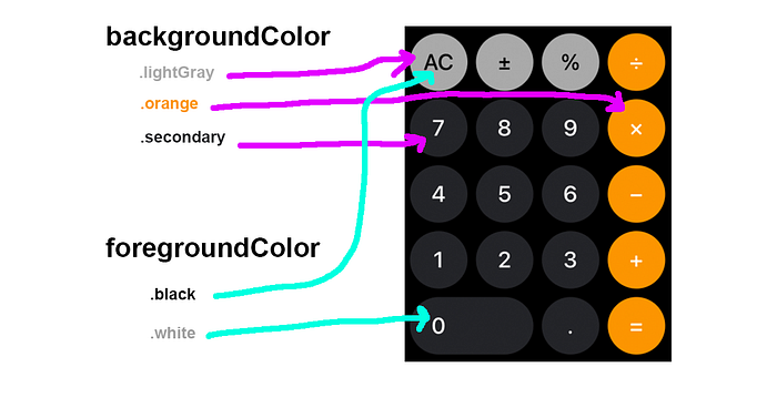
Add import SwiftUI at the top as we need to reference Color
Create two computed properties of type Color named backgroundColor and foregroundColor and return the corresponding color for its case.
We are finally done with our ButtonType model! We now have all the necessary information to build our ButtonPad containing buttons with their corresponding text, background color, and foreground color.
When we start building our ButtonPad view, everything will make more sense.
Building the ButtonPad
Perfect, we have our ButtonType enum with all the calculator button types. The problem? — There’s no order yet.
In what order the buttons are displayed is the responsibility of the view, not the model. So let’s go back to our CalculatorView and add a new buttonTypes 2-dimensional array with the correct button type order.
Now that we have a 2-dimensional array with the ButtonType order, we are going to start Building the ButtonPad. We need to create a VStack with its corresponding HStack views and inside each Button.
Replace the // TODO: ButtonPad line with the following code

Don’t worry about the button design, we’ll get right to it in a bit.
Your CalculatorView file should look something like this.
The code is getting kind of dirty and we are far from done, so let’s do a little refactoring to make everything a little clearer.
Encapsulate displayText and buttonPad and move them into an extension a the bottom of theCalculatorView file
Now the code is easier to understand. I like to encapsulate components this way when they start getting a little too complex.
As we can see, design-wise, the calculator buttons are looking abysmal. We’ll create a new CalculatorButtonStyle to fix that right away.
Create the CalculatorButtonStyle
Create a new group named Styles and add a new Swift File named CalculatorButtonStyle:

We will create a custom ButtonStyle for our calculator buttons. If you want to learn more about creating custom ButtonStyles, I already wrote a story, you can find it here.
For now, we need to set 3 properties for the style. — the button size, the foregroundColor, and the backgroundColor.
Add the following code:
If you’ll like to see a live Preview of the ButtonStyle, you can add this code on the bottom of the file.

Now, let’s go back to our CalculatorView file, find our buttonPad property, and add the buttonStyle modifier with our newly created CalculatorButtonStyle. Pass the corresponding parameters. For now, use size: 80, we’ll calculate the correct button size at the end.

Final Details
We are almost done with our CalculatorView. We are just missing 2 important details.
- We need to calculate the button size (to get rid of the
80constant). - We need to make the “0” button wide.
Small Refactor — CalculatorButton
Before continuing with the final details, let’s do a little refactoring on our CalculatorView as we are going to be adding a little bit of extra complexity, it’s a good idea to maintain our code as clean as we can.
We are going to encapsulate the calculator button into its own struct.
Create a new group inside Views named Components. Inside, create a new SwiftUI View named CalculatorButton.

In larger-scale apps, it would be good practice to include all the components exclusively used by the view below, in our case, all components that are exclusively used by the CalculatorView.
This is a refactor, so no new functionality will be added. We are simply moving code around to make it cleaner.
Cut and paste the Button code from CalculatorView into the CalculatorButton body.
Notice how I made an extension of CalculatorView and added the CalculatorButton struct inside? That’s good practice. CalculatorButton is not going to be used outside of CalculatorView so we can declare it inside.
Extra: If you want to use Previews for this view, add this code:
Finally, add our newCalculatorButton to the CalculatorView
No new functionality was added in this step, but our code is way cleaner.
Calculating the Button Size
Now, a little bit of math. To calculate the button size we are going to need the screen width, the button count, and the sum of spacings between each button and outer padding.
- We can use
UIScreen.main.bound.widthto get the screen width. ✅ - The button count is easy, there should be 4 buttons on each row. ✅
- Getting the spacings and paddings might get a little bit trickier. ❓
Let’s set constant spacings and paddings.
We have something called implicit spacings right now. We have not explicitly set the spacing amount in our buttonPad stack views. We also have no padding set on the outside of the CalculatorView, so our buttons technically extend to the edges of the screen.
Let’s first set a constant spacing/padding amount that we can access throughout our app.
Create a new Swift File name Constants.

Import CoreGraphics (as we’ll reference CGFloat) and create a static padding property.
We now have a constant, padding, we can use anywhere on our app.
Go back to CalculatorView.
Insert the .padding() modifier set to our Constants.padding property over the .background() modifier
Scroll down to the buttonPad property, set our Constants.padding to both the VStack and the HStack spacings
Now, let’s calculate the buttonSize.
Go to your CalculatorButton file and add the following function under body

Lastly, replace size: 80 with size: getButtonSize() in the buttonStyle parameters.
Final CalculatorButton code should look like this
Making the “0” Button Wide
Final detail. We can observe a difference in button shape with the “0” button over all the other buttons. As for now, our CalculatorButtonStyle can only set buttons to be circle shaped. — Let’s update that so we can give the “0” button its wide capsule shape.
Going back to our CalculatorButtonStyle, under foregroundColor, add the following property:
var isWide: Bool = falseNote: If isWide is not set, it will be set to false by default.
Go to makeBody and under the .frame() modifier add the following modifier:
.frame(maxWidth: isWide ? .infinity : size, alignment: .leading)The final code for CalculatorButtonStyle should look like this:

Finally, go back to CalculatorButton and in the CalculatorButtonStyle initialization, just below foregroundColor, add the following line:
isWide: buttonType == .digit(.zero)
Your final CalculatorButton code should look like this:
Wrap Up
Whew, that was long... Thanks for pulling through.
We are finished with the calculator view. Building views is always very time-consuming, especially when we stick to best practices without taking hacky shortcuts. Maintaining your views simple (code-wise) is essential for building larger apps, so always try to encapsulate when the views get a bit too complex.

In the next tutorial, we are finally adding functionality to the Calculator. We’ll see how the models we created for ButtonType will facilitate us greatly in making the Calculator work. We’ll add the CalculatorViewModel and a Calculator class that will be in charge of computing everything.
You can continue with part 2 here.

