Writing Your First Qwik Component
An exploration of this fantastic framework

In the last few weeks, I’m deep diving into the Qwik framework in preparation for a session I’ll deliver at TechRadarCon 2022. I also implemented a full demo app with Qwik and QwikCity to get familiar with the framework developer experience.
In this article, I will show you how to develop a simple Qwik component and expose you to some things you need to know while developing your components.
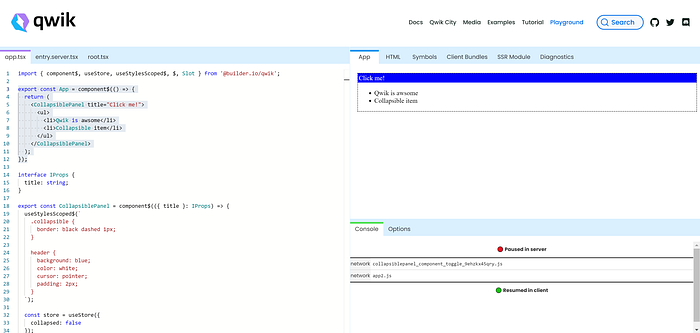
Qwik Playground

One of the nice features you can find on the Qwik website is the Qwik Playground. In the playground, you can write components using Qwik syntax. In the right pane, you can get info about the component’s rendering, errors, symbols and can even configure how things are rendered using the Options tab at the bottom.
You can use the playground as the environment to build the component I’ll implement in the post, or you can create a new project using Qwik CLI and add the component.
Building the Component
In this article, we will build a simple collapsible panel component. The component will have a clickable header, which will collapse its content. The content will be injected from the outside.
So, let’s do it :).
The following code is the complete example, which will be explained later on:
Let’s break it down
Qwik embraces TypeScript, so we will first create an interface for the props that the component will receive. Here is the interface implementation:
interface IProps {
  title: string;
}
Now that we have the interface, let’s use it and let’s declare the component using Qwik syntax:
export const CollapsiblePanel = component$(({ title }: IProps) => {
   ...
});
As you can see, you use the component$ function to create a Qwik component. The $ sign is there to direct Qwik optimizer to treat this function in a specific way (in this case, as a Qwik component).
Note: I’m not going to discuss the optimizer, and I encourage you to read about it here.
Now that we declared the component, let’s implement it. Qwik uses JSX to code how the component will be rendered. At the end of the component, we will return the following JSX:
return (
    <div className="collapsible">
        <header onClick$={toggle}>
          {title}
        </header>
        <section hidden={collapsed.value}>
          <Slot />
        </section>
     </div>
);
As can be seen, we return a div with some implementation. I marked two important things in the code which you should be aware of. The onClick$ is the way to wire events in Qwik with the $ sign at the end. Again, the $ sign is there for the Qwik optimizer. The Slot component is a special Qwik component that enables content injection into the component. We will discuss the store later on.
Now, let’s add some style. If you want to create a style barrier between your component and the outside, you can use the useStylesScoped$ hook. The useStylesScoped$ hook receives the style you want to encapsulate inside your component and impose it on the component.
useStylesScoped$(`
    .collapsible {
      border: black dashed 1px;
    }header {
      background: blue;
      color: white;
      cursor: pointer;
      padding: 2px;
    }
`);
In the example above, we add style to the container div and the header element. When rendered, Qwik will ensure that the style will be specific only to the component; therefore, the style won’t leak from it.
To have an inner component state, which Qwik can serialize, you will need to use the useSignal hook. The hook creates a reactive signal where its content can be tracked by Qwik and serialized. In the collapsible panel example, the signal is storing the component collapsed state:
const collapsed = useSignal(false);Last but not least, we implement the toggle function, which will be used to toggle the content:
const toggle = $(() => {
    collapsed.value = !collapsed.value;
});
Since the toggle function isn’t inline in the component’s JSX, you need to use the $(async () => { … }) syntax to ensure that the Qwik optimizer understands that this will be a Qwik component function that is being used in the JSX.
That is it. Now you can play with the component.
The following code is a consuming component that runs the collapsible panel:
export default component$(() => {
  return (
    <CollapsiblePanel title="Click me!">
      <ul>
        <li>Qwik is awsome</li>
        <li>Collapsible item</li>
      </ul>
    </CollapsiblePanel>
  );
});
Summary
In the article, we implemented a Qwik collapsible panel component. This is a simple component, but it shows some of the concepts you will need to be familiar with if you are writing Qwik components.
As always, if you have any feedback, let me know.

