Parallax Scrolling With Jetpack Compose
The art of moving things and moving other things differently.
L-O! Sorry, that’s me trying to say “hello” phonetically with an English accent. No? Try it again with extra emphasis on the L? Still no? Okay, I’m terrible with accents. Let’s move on to Android development.
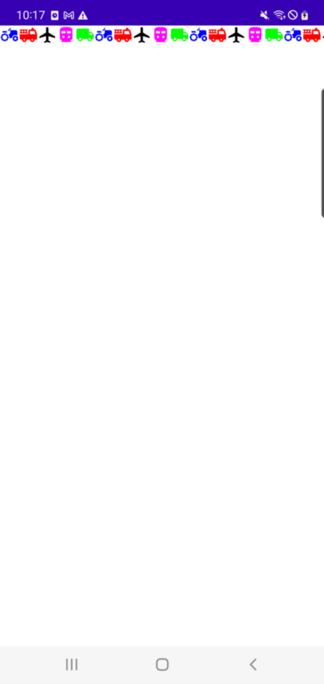
So first off, I’m not a Compose expert here to tell you how it’s done. I’m a solid Android developer who’s transitioning to Compose and anxious about having to start over with some of the old tricks. I have a few things in mind and I was thinking it might be nice to document some proofs-of-concept as I knock them out and share them with anyone who cares. So before you DR because this is TL let me show you what we’ll be accomplishing:

Now you might be thinking, “Hellajoey, that looks great but also do you have a thing for colored vehicles or something?” And the answer is “no” but I do like being able to go places without walking. Shoot me for adding a little color.
Moreso, I always kind of ha… — hate’s a strong word — get mildly frustrated when I go through a code tutorial, and all of a sudden the tutorial project is packed with a bunch of embedded images. Then I have to go find a bunch of images myself. I ha... it.
So my goal is to make sure my Android tutorials can be generated entirely from scratch within Android Studio and that’s going to get you some brightly colored vehicle images from time to time.
Creating colored icons from within Android Studio isn’t tricky and this post is already TLDR before we’ve even started so I’ve created another post here explaining how I did it for anyone who might want to take that aside.
Create the Project
Okay, now go ahead and create a new Empty Compose Activity like so:

Give it a run. If it doesn’t work, figure it out.
Open up your MainActivity.kt file and clear out the “Greeting” code or whatever “Hello World” template code is in your default implementation. It should then look something like this:
Now we’re going to create a LazyRow of some stuff with names. As you know, my stuff is going to be cute, colored vehicles. If you’re following along with me, once again, you can go here to see how to create these images.
We’re going to need a container for the individual vehicle data so I’m creating this data class:
data class Vehicle(
   val name: String,
   val imageId: Int,
   val color: Color,
)
Put it wherever you want. I’m now going to add a vehicleList in onCreate() so we have something to scroll through.
Regular Compose Stuff
Now let’s add a standard LazyRow implementation. This is the plain vanilla stuff. Also, I’m just going to add the composables right in the MainActivity to keep it simple (single file demo, baby!).
If you run it, it should look like this. Beautiful, right?
Some Preparation
Okay, now let’s do some clean up and preparation before getting into the parallax parts. As a token of foreshadowing, we are going to need some fiddly data bits to configure the parallax effect.
To this end, I’m going to create a VehicleUiInfo data class to contain said data.
data class VehicleUiInfo(val itemWidthDp: Float) {

   companion object {

      fun create(itemWidthDp: Float): VehicleUiInfo {
         return VehicleUiInfo(itemWidthDp)
      }
   }
}
This is definitely overkill for just the item width — which is all we need at the moment — but we will be adding more fiddly bits later.
The CompositionLocal Pattern
Now we don’t have a very deep composable tree but let’s go ahead and get started with the CompositionLocal pattern for Compose anyway. It’s pretty dope.
I’m not going to get into all the nuts and bolts — you can Google it for the details — but the idea is that rather than pass certain, fiddly data down through all of the composables we can just define it upfront and access it when needed. CompositionLocal is more powerful than just that but we’ll only be using this minimal functionality.
To get started, create:
val LocalVehicleUiInfo = staticCompositionLocalOf { VehicleUiInfo(0f) }and put it above your composable functions. We must provide a default value upon creation but we’ll be replacing it with our intended value once we’ve straightened it out so just use a dud for now.
Next we’ll create our real VehicleUiInfo object in onCreate() and set it as the provided value for LocalVehicleInfo. Your MainActivity should now look like this:
We can now use our vehicleUiInfo.itemWidthDp value in VehicleItem() like so:
Righteous. Now things are bigger and better and badder.

You could also access your vehicleList object using CompositionLocal but primary state objects should be passed by parameter. Dive into CompositionLocal to learn more.
ConstraintLayout (Yes, for Compose)
Next, let’s center the row in the screen. It’s time to introduce you to one of my best friends, Mr. or Mrs. ConstraintLayout. Okay, you probably already know their cousin from view-based layouts but don’t miss out on continuing the awesome by using this version with Compose.
First off, add this library reference to your module-level build.gradle file:
implementation “androidx.constraintlayout:constraintlayout-compose:1.0.0”Then we’ll wrap our Image composable in a ConstraintLayout composable in the VehicleItem() function.
A couple of things to note here:
val (image) = createRefs()allows you to reference your composables so you can lay them out in relation to one another within the ConstraintLayout.
.constrainAs(image) {
   top.linkTo(parent.top)
   bottom.linkTo(parent.bottom)
},
is centering our image vertically within its parent (which has full-screen height).
Add the Text Composable
Now is a good time to also add our vehicle names to the layout. Insert the following code under the Image composable in VehicleItem():
Also, add a name for this Text composable to the ContraintLayout references (yes, I named mine “name”):
val (image, name) = createRefs()This code centers the Text composable below the Image composable:
.constrainAs(name) {
   start.linkTo(image.start)
   end.linkTo(image.end)
   top.linkTo(image.bottom)
}
but I thought it was a little too low so I also brought it up a bit with:
.offset { IntOffset(x = 0, y = -50) }If you run the app you should now see this:

Getting pretty close! Just one more thing before we parallax.
Make it Snappy
Per the design I’ve laid out, we’re going to want the scroll behavior to be such that the center item will “snap” into place.
At the time of this writing (May 2022) I don’t believe Jetpack has intrinsic support for item “snapping”. That surprises me so maybe they do deep down somewhere. I couldn’t find it though so I’m going to use Chris Banes’ pretty awesome snapper library. Just add this reference to your module-level build.gradle file:
implementation “dev.chrisbanes.snapper:snapper:0.2.0”Then modify your VehicleHorizontalScroll() function to look like this:
I don’t like depending on experimental classes as a matter of course but I also suspect we should have a first-class citizen, snapper functionality available sometime soon.
Run it and make sure it works. You’ll notice that when the screen starts it looks just the same as the previous image. That is, we don’t have a horizontally centered middle item when we’re at either edge of the row (unless you got “very” lucky with your phone’s screen width). You have to start scrolling before any snapping occurs. I’d really like to fix that by adding buffer so that the first item begins centered (and corresponding buffer at the end of the row) but that’s going to rely on some of the info we’ll be using for our parallax effect so we’ll just blend that in later. We’ve been waiting long enough.
Adding the Parallax Effect
Okay so here’s where it starts to get kind of real. We’re about to get mathy with the width of the screen. Now let’s look at what we’re actually trying to do:

When an item is perfectly centered we want its name to be perfectly centered below it but as it moves to the left or the right we want the name to move faster to the left or the right (Yes, I know the items are actually flush but I thought it looked cooler with some space in-between. Everything still works if they’re separated).
So the first thing we need to do is figure out when an item is perfectly centered. As we see in the following diagram, that is going to be when the item’s x-coordinate is (width-of-screen - width-of-item) / 2.
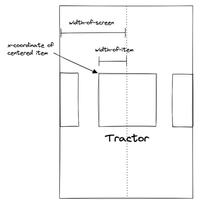
If we start at x = 0 then move out to the right (width-of-screen) / 2 then move back (width-of-item) / 2 we will arrive at the x-coordinate of a centered item. And of course:
(width-of-screen) / 2 - (width-of-item) / 2 = (width-of-screen - width-of-item) / 2
Let’s go ahead and add this value to our VehicleUiInfo class. We’ll call it xForCenteredItem. However, to calculate it, we first need to actually get the screen width (we already have the item width). There are different ways to do this and I recommend handling it once when the app starts along with whatever other configuration you set during your start-up Activity.
Or… Getting Screen Width with LocalConfiguration
However… since we’re trying to keep this simple and since I found a new way to get screen width using Compose I’m going to go against my own advice here and just grab the screen width ad hoc within our setContent block. This method can only be used within the context of a composable function but it’s also an awesome one-liner:
screenWidthDp = LocalConfiguration.current.screenWidthDp.dp.valueNow that we have screen width and item width, update VehicleUiInfo to the following:
It turns out we’re actually going to want our xForCenteredItem value in both dp units and px units so rather than calculate the px value on each recomposition we’ll store both values in vehicleUiInfo and do the calculation only once. We’ll do this by multiplying the dp value by the device density.
If I wrote that confusing-like — and I did — just make it look like this:
Then pop the instantiation of your vehicleUiInfo object inside setContent (required for LocalConfiguration.current) in the onCreate() method like so:
Yes, you also need to update your default vehicleUiInfo in LocalVehicleUiInfo.
Brief Aside to Buffer the Front and Back of the Row
Let’s take a brief aside and add that buffer on both ends of the row that we were talking about earlier. Notice that the width of said buffer would be equal to the x-coordinate of a centered item. (That’s why we need the dp version of xForCenteredItem).
In the LazyRow in VehicleHorizontalScroll() add an item function before and after the existing items function, which will each render VehicleScrollBuffer():
Notice we set the width of the buffer to be xForCenteredItemDp. Nice.
If you run the app now it should start like this:

Time to Implement the Parallaxing for Real
Okay, now it’s time to implement the parallaxing for real. So again, what we want to be able to say is “When the item is offset from the center of the screen the text will be offset by more in the same direction.”
How much more? We’ll just make that a variable called parallaxOffsetFactor that we’ll store in our vehicleUiInfo object like so:
That way we can simply tweak it until we like the way it looks. In the animation at the top of this post I have it set to .33 as in:
val vehicleUiInfo = VehicleUiInfo.create(
   screenWidthDp = LocalConfiguration.current.screenWidthDp.dp.value,
   itemWidthDp = 200f,
   parallaxOffsetFactor = .33f,
)
That should mean that whatever the absolute offset of the item is from the center, the Text will add .33 of that offset to its own offset. It should move 4/3 as quickly.
Before any of that, we first need to know what the offset of the item is.
Since we know that vehicleUiInfo.xForCenteredItemPx is the x-coordinate for an item that has 0 offset (x-coordinates are always in px), the offset of any given item is the difference between its x-coordinate and vehicleUiInfo.xForCenteredItemPx.
What is the x-coordinate for a given item? We’ll track that in a variable that remembers its value across recompositions like so:
var itemX by remember { mutableStateOf(0f) }and we can set the value on each recomposition in the
Modifier.onGloballyPositioned {}property of the Image composable like so:
Modifier.onGloballyPositioned { itemX = it.positionInWindow().x }Now that we know the x-coordinate of an item at all times and we know the item’s offset from center is the difference between its x-coordinate and vehicleUiInfo.xForCenteredItemPx we can define our very mostest important variable. It’s the moment we’ve been waiting for:
val offsetFromCenterPx = itemX - vehicleUiInfo.xForCenteredItemPxTa-da.
Since itemX is delegated with by remember and it is also set in the Image composable, put your offsetFromCenterPx declaration under the Image composable. Otherwise it will initiate a useless recomposition.
Now when the item becomes *more* offset from center we want the Text to become *even more* offset from center by a factor of vehicleUiInfo.parallaxOffsetFactor. Therefore we will update our Text offset modifier to:
.offset {
   IntOffset(x = (offsetFromCenterPx
      * vehicleUiInfo.parallaxOffsetFactor).toInt(), y = -50)
}
Your VehicleItem() function should now look like this:
Cat in the hat and that’s that. How awesome are we now?! Your item names are parallaxing all over the place!

Adding the Text Fade-Out
The only remaining step to make our scrolling match the animation at the top of this post is to have the names fade away as they move from center. It’s not terrible the way it is now but it’s a little weird that when those very cute vehicles appear on screen their names are way off screen because they are “pre-parallaxed” so far away from them.
To fix this issue we’re going to only show the name of the center item and we’re going to fade it out when it parallaxes too far away.
This part will be simple. First, we’ll make our last update to VehicleUiInfo by adding the parallaxOffsetFadeDistancePx variable:
Now when we create our vehicleUiInfo object we pass in the new itemWidthFactorForFadeDistance variable. If you set this to 1 the name will fade out when the item is 1-item-width away from the center. For my money, I’m setting the value to .5f (that’s where the name starts to fade out just about the same time a new one fades in). Set yours to whatever you darn well want:
val vehicleUiInfo = VehicleUiInfo.create(
   screenWidthDp = LocalConfiguration.current.screenWidthDp.dp.value,
   itemWidthDp = 200f,
   parallaxOffsetFactor = .33f,
   itemWidthFactorForFadeDistance = .5f,
)
The last step is to actually apply the fade. Add this variable to your VehicleItem() function:
val alpha = ((vehicleUiInfo.parallaxOffsetFadeDistancePx -
   abs(offsetFromCenterPx)) /
      vehicleUiInfo.parallaxOffsetFadeDistancePx).coerceAtLeast(0f)
This may look complicated but it’s just based on the classic normalizing form (K - x) / K where K is a constant. Notice that when x = K the value is 0 and when x = 0 the value is 1. This is exactly what we want for the alpha of our parallaxing names.
In our case, when:
abs(offsetFromCenterPx)) = vehicleUiInfo.parallaxOffsetFadeDistancePxthe alpha is 0 and when:
abs(offsetFromCenterPx)) = 0the alpha is 1. We also use:
.coerceAtLeast(0f)so that when:
abs(offsetFromCenterPx)) > vehicleUiInfo.parallaxOffsetFadeDistancePx)we don’t end up with a negative number.
Apply the alpha to the modifier of your Text composable:
Actually Done
That’s it. You really are done!
Your parallax-scrolling, named, cute vehicle row thing should now look like this:
Give yourself a big hand!! Also feel free to let me know if you can think of some improvements. I really can take it.
Thanks for reading!

