Member-only story
3 Ways to Style SwiftUI Buttons
Using view modifiers, custom views, and styling

Using mobile apps, we navigate to another view, calculate business expenses, or send a tweet by tapping on a button. SwiftUI makes it a breeze to construct a button.
This time we will talk about how to do it in three ways:
- using the view modifier approach
- building a custom view modifier
- applying the button style
We are going to start with the most basic SwiftUI button and style.
Button("Continue", action: {})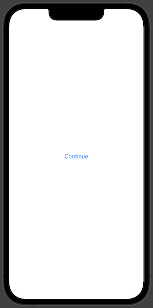
Using a Custom View Modifier
In SwiftUI view modifiers are used to change the view in some kind of way. We can build custom view modifiers ourselves. We will try to build one to create a custom button.
At first, we need to create the custom modifier. To do that we should use the ViewModifier protocol that requires implementing one function func body(content: Content) -> some View which takes in a view and produces a different version of that view.
struct CustomButtonModifier: ViewModifier {
  func body(content: Content) -> some View {
    content
      .font(.title)
      .foregroundColor(.white)
      .padding()
      .background(Color.blue)
      .clipShape(RoundedRectangle(cornerRadius: 20))
  }
}
We can apply the newly made view modifier with a .modifier modifier to the original view, but we can create an extension to the View protocol. That would allow us to use it in a more shorthand way.
extension View {
  func customButton() -> some View {
    modifier(CustomButtonModifier())
  }
}
We can create a SwiftUI button view now and apply our freshly created view modifier.
Button("Continue", action: {})
  .customButton()
Building a Custom View
Now let’s look into how we can style a SwiftUI button by building a custom view. We need to create a custom view that we will pass into label…


