The SwiftUI Toolbar in iOS 14
Let’s look at the new modifier to smartly place views in our layout
Toolbars are amongst the interesting additions to SwiftUI’s second iteration during WWDC 2020.
Essentially, toolbar is a modifier that lets you place a wrap around a bunch of view controls and set them at desired locations.
By default, SwiftUI can smartly determine and set views at desired locations with the toolbar modifier, but you can also explicitly set it using ToolbarItem.
In the next few sections, we’ll look at:
- The need for the
toolbarmodifier - Using Toolbar API to automatically set items in the bottom bar and navigation bar
- Using
ToolbarItemfor manual placements
Need for SwiftUI Toolbar
Previously, setting a bottom bar in SwiftUI was a headache. You’d probably have used UIViewRepresentable to display a UIToolbar.
Similarly, to customize the navigation bar at the top, earlier, you’d have to fall back on the underlying UINavigationBar. Yeah, yeah, doing stuff in init functions makes it look like a UIKit app and not pure SwiftUI.
Gladly, the new toolbar modifier lets us wrap views and set placement positions of our choice. So it’s fairly easy to add a view control at the bottom or top of your screen as well as set items as primary actions or confirmations in case of watchOS.
Automatic Placements With SwiftUI Toolbar
Let’s see how to set up a few views with the SwiftUI toolbar modifier.

It’s important to take note of a few things:
- For the toolbar to work, your view needs to be wrapped in NavigationView.
- By default, the first item in a toolbar is placed as a right bar button of the navigation bar in iOS and macOS.
- The second item is idiomatically placed at the center of the bottom bar.
- If you specify a
Labelinside the toolbar, it may only display the image, due to space constraints. TheTextwill be used for accessibility purposes in such cases.
While the above way of specifying toolbar layouts is fine, sometimes you wish to have more control.
Fortunately, we have ToolbarItem just for that.
Use ToolbarItem for Manually Positioning Items
According to the Apple docs, ToolbarItem is “a model that represents an item that can be placed in the toolbar or navigation bar.”
ToolBarItem lets us wrap views and define the position in the following way:

So, we have a few modes of placements:
principal— This puts the view in the most prominent part of the screen. In iOS and macOS, it’s the title view.navigationBarLeadingandnavigationBarTrailingare used to put items at the left and right ends of the navigation bar.bottomBarsets the item in the toolbar at the bottom of the screen.automaticis what we saw in the previous section. It finds the most apt position based on the platform and on spaces available.
It’s important to note that if the navigationBar display mode is set as automatic, the principal placement will be ignored. Hence we’ve specified inline mode above.
ToolBarItem makes it easy to create a custom navigation bar if need be.
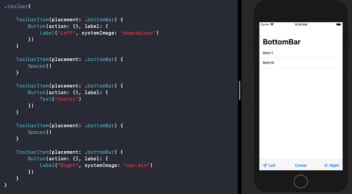
To style the bottom bar with multiple items, we need to ensure that the order is preserved. This means the leftmost item is placed first as shown below:
Conclusion
We explored the new toolbar modifier and saw how using ToolbarItem helps set the position of view controls.
This new API will help build platform-independent toolbars.
That’s a wrap-up. Thanks for reading.

