SwiftUI — Basic components
A simple introduction to UI components in SwiftUI

I’m going to present a series of UI components using SwiftUI. Each component will be described in a few simple lines. You might find this article useful as a guide.
Contents
- User Inputs: Toggle, Slider, TextField, picker, datePicker and SegmentedControl
- Containers: Scrollview, Table and Form
- Presenters: Alert, ActionSheet and Popover
- SwiftUI example project
Toggle
The purpose of Toggle is simple: it is used to bind a property. In some cases, we can use it to alter the screen, showing or hiding other views.

TextField
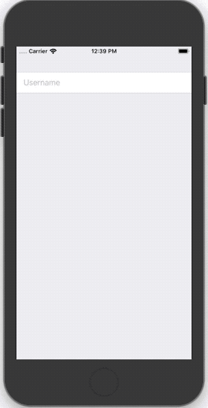
To use a TextField we just need to specify a placeholder(String) and a binding.
Picker
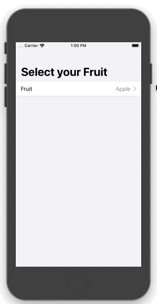
Picker has a plus in SwiftUI. Using it inside a Form the app will navigate to a detail view with the option list.
If we want to show the picker with the classic inline style, we just add the line .pickerStyle(.wheel).
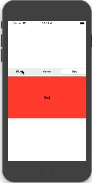
Segmented Control
Segmented control is a nice tool to show different views on the same screen.
Containers
ScrollView
Implement it via the ScrollView view:
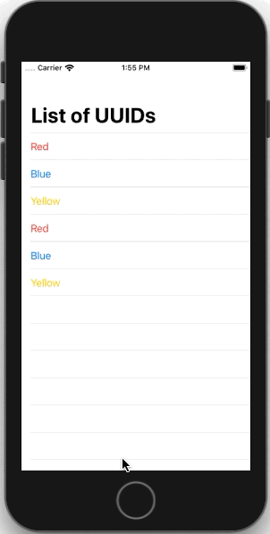
List of Items
To show a table in SwiftUI we should use a List view. The List can show static or dynamic content based on your needs. However, it is simple to use because we don’t need to write a lot of code to register the cell or to tell it how many rows there are, etc.
Using an array of objects (identifiable protocol) and a subview inside the content block:
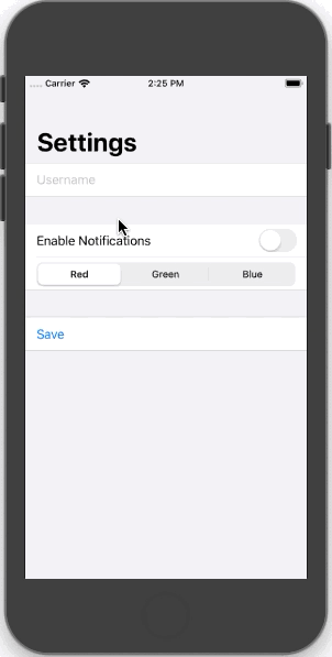
Form
SwiftUI’s forms work as containers, so we can add other views inside them and they will automatically adapt their behaviour and styling.
We can separate input components with the Section view:
Presentation
This section shows some of the methods we have to present the information.
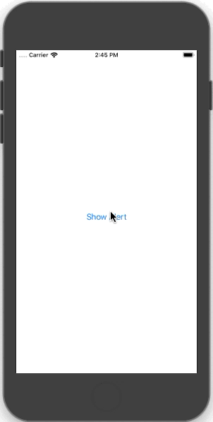
Alert
To create a simple alert we must define a title and message, and add a dismiss button.
To show the alert we add a bindable condition that determines whether the alert should be visible or not.
For example, the following code uses a showingAlert (Boolean) that tracks whether the alert should be shown or not:
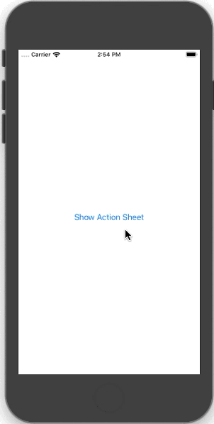
ActionSheet
The ActionSheet has the same implementation as Alert.
Popover
Following the same logic that Alert uses, if we want to show a popover we have to pass a boolean Binding to control the visibility of the Popover and specify the content:
SwiftUI Application
If you want to see the previous examples and other components of SwiftUI, I have created an example project where we can see how to create an application using SwiftUI. This is the repository link: https://github.com/lucasPelizza/SimpleSwiftUIExample/tree/master


Final words
I hope that this article was helpful for you!

