Member-only story
PX, EM, or REM? Examining Media Query Units in 2021
Testing breakpoint behaviour in different browsers

I recently wrote an article where I called out Bootstrap for using pixel-based breakpoints. I mentioned that relative (e.g., em- or rem-based breakpoints) are better for accessibility. It was the reason I had switched to using em for media queries a while back. But since I don’t code anymore, I had never reviewed this decision.
After the article was published, this statement sparked a lot of discussion amongst fellow developers. While many developers I spoke to said they had never really thought about choosing em or rem over pixels, others strongly advocate one unit over the other.
So I was curious to examine the advantages and disadvantages of each. I came across Zell Liew’s article, which includes some brilliant experiments, and which ultimately reaches the conclusion that em-based breakpoints work best across all browsers, while pixel-based ones cause the most issues. However, this piece was written in 2016.
So let’s have a look at breakpoint units in 2021. Are we still facing the same issues for accessibility and browser compatibility? Or have modern browsers changed for the better or the worse?
What’s the deal with accessibility?
First of all, I would like to examine the statement that relative units are better for accessibility, and the reasoning behind this.
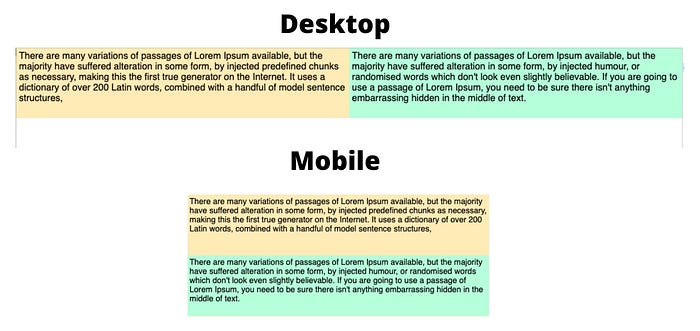
Let’s take a look at a classic example for breakpoints. There are two boxes on a page, with text in them. They sit side by side and have a fixed height. The text should stay in the box, so the designers have requested for the boxes to stack on top of each other as soon as the text would overlap.

To keep things simple, I am floating the elements at a min-width of my defined breakpoint. I am using the same setup but three different breakpoints:
@media (min-width: 1000px) {
...
}
@media (min-width: 62.5em) {
...
}
@media (min-width: 62.5rem) {
...
}
