How to Code Mubasic-like Piano Keys Using TypeScript and React
Building fun features to capture user interest

This is the start of a series where I document my process, coding features from websites I find interesting.
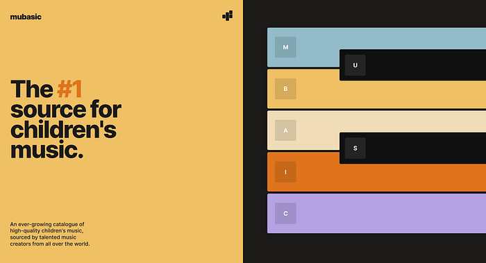
I came across this playful website, Mubasic, which provides a catalogue of children’s music. The piano keys were a fun feature to welcome you into the site, and kept me engaged long enough to scroll down and discover what the product was about. To me, a well-designed product page has features that can hook users into being curious about it.
Toolbox
I’ll be using React and TypeScript to create components, Next.js for production, and Sass to organize and maintain my CSS.
Creating a Plan
It is often a good idea to write out steps for what we need to do to build out our feature (this is known as pseudocode). Pseudocode acts as an informal guide and helps us plan our code accordingly.
Even if we don’t know what steps to take, it is okay to write out what we think are the steps, and adjust them later.
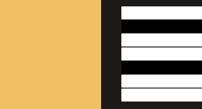
So, let’s take a look at the design and figure out how to approach this.

CSS tip — open your browser’s developer tools (F12) and find the * selector under the styles panel, entering the CSS below:
* { border: 1px solid red; }This selects all elements and applies a solid, red border. Useful for understanding how elements are arranged, and making it easier when debugging CSS.
Based on my observations, I’ve written out the following pseudocode:
// create a section divided into two
// create seven piano keys
// add a letter with button styling for each key
// add hover animations to each key using CSS
// play music when key is clicked or letter is pressed
Creating the Background
I’m creating a new page in my project directory called Mubasic.tsx.
In this page, I wrapped two divs in a section tag and imported the styles from a CSS module file.
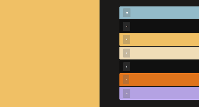
Then, I color-picked the background colours and stored them as variables. This makes it easier to maintain the CSS, allowing me to reuse and make changes to variables from one central file.
Now I can import this CSS module into my stylesheet, allowing me to use those variables. Each div has a class which takes up 50% of the section width and 100% of the viewport height.
Creating Piano Keys with React Components
Let’s leave the left side empty for the time being and focus on the right.
I created a React component called PianoKey which accepts a boolean prop, color. Using a ternary operator, I can conditionally render the styling of each key by passing in either true or false to color.
Creating a Scalable Component
I’m constantly thinking — how can I improve what I have so far?
I can improve the component by iterating over data. That way, I won’t have to duplicate the piano keys multiple times.
In a separate file, I create an array of objects for each key, an example of the array with the first object would look like this:
Each object contains a letter which corresponds to the label shown on the key. isColor represents the type of piano key, used to conditionally render styling for each key. We leave audioName empty for now, until we need to implement audio. The backgroundColor property allows each key to have their own color.
It’s time to update our component.
I imported the data and used the map method to iterate over it. The map method will return as many JSX elements as there are objects in the array.
Now that we have access to background colors and letters for each key, I can use inline CSS to set each key’s colour, and fill in each letter with dot notation.
Positioning the Keys
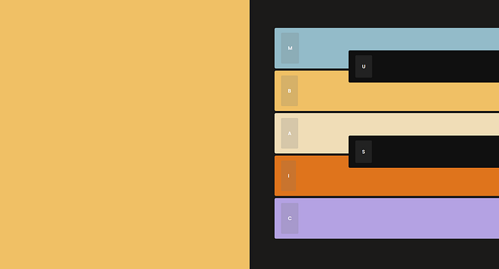
Let’s address the positioning for the black keys — they need to be positioned on top, and between the keys adjacent to them.
I wasn’t quite sure how to achieve this, so I googled “how to overlap elements relative to each other.” The first search result was this StackOverflow question, asked nine years ago.
After reading, I learned that I can wrap the keys in a relative-positioned div, while using absolute-positioning on the keys themselves. However, I only need to wrap the black keys, which means the wrapper must be conditionally rendered.
I’m creating another component called ConditionalWrapper, which accepts three properties: condition, wrapper, and children.
The wrapper prop calls a function which returns the children of ConditionalWrapper, wrapped, based on the condition prop (isColor).
In our CSS, I position the keys using top and left (negative value of top shifts up, left shifts element to the right).
If you want to understand more about how the conditional wrapper works, here’s a great article which goes into more detail.
Creating the Hover Interaction with CSS Transitions
It’s time to add some interactivity! Luckily, the next step doesn’t require many lines of code.
I added a hover pseudo-class to the piano key classes and used the translate function to shift the keys right.
To customize the transition’s easing-function, I used cubic-bezier. This tool helps visualize the motion of your transitions and allows you to easily export cubic-bezier functions into your CSS. Easing functions can add life to your product and make transitions appear smoother.

Adding Audio with useSound
I’m using a React hook called useSound, which allows you to add and configure audio for your project. It’s published by Josh W. Comeau, who has an amazing tutorial demo for it.
Following the documentation — I created a SpriteMap, a single file containing multiple audio segments, using Adobe Premiere Pro.
In the useSound hook, I pass in the path to the sprite map, and map the IDs to their respective audio segments.
Finally, we can update audioName in PianoKeyData to match the IDs that we set in our sprite map.
Then, attach an onClick event listener to the piano keys to play the matching audio segment.
To make the audio play whenever a letter on the key is pressed — I’m implementing a custom hook called useKeyboardBindings. This hook adds a listener to the window which executes the handleKeyDown function when a key is pressed. The function checks if the value of spriteMap[e.key] is a function, and if so, executes it.
To use the hook, we have to import it in our component and map the keys to the play function.
Finishing Touches
It’s time to clean up the design. I laid out the remaining content on the left using Flexbox; recreated the logo in HTML and CSS; adjusted the dimensions to make it match the original design more.
For a better user experience, I set the cursor to pointer when hovering over the keys, which lets users know that the keys are interactive.
After doing some digging, I changed the key prop for each key to a unique identifier. I used index in the examples above, which will throw errors if the list is modified. Although it doesn’t affect this project specifically, I feel like it’d be right to address it here. This thread from StackOverflow explains why you shouldn’t use the array index as your key prop.
Feel free to check out the demo:
- Live: https://lets-code-chi.vercel.app/pens/mubasic
- Repository: https://github.com/waynecen/lets-code
Summary
I hope that by reading this, you’ll be inspired to seek discomfort in challenging yourself with things you’ve always wanted to try or learn, especially if you think it’s challenging.
When I started this project, I knew nothing about using Next.js or writing custom react hooks — and that’s okay. Coding is all about persevering through tough problems, learning, and being stubborn when you feel like giving up.
Keep in mind that the code presented in this article is a “finalized” result and not the first step taken. I stumbled through many errors with the purpose of learning. I don’t want to give off the impression that I made a plan and executed it perfectly.
“Make the plan, execute the plan, expect the plan to go off the rails, throw away the plan.” — Leonard Snart
Thanks for reading.


