Learn to Build a Masonry Gallery Layout Using Pure CSS
Build a CSS grid like Pinterest

Today, I’m going to show you how you can build a complex masonry grid using CSS Grid. CSS Grid has changed the way we design our layouts and we’re going to build a fun project using its features.
If you feel rusty with CSS Grid or you feel the need to brush up, I suggest you read through this article. In any case, I’ll explain every code I’ll introduce to build our project.
Alright. Let’s dive in.
What We Will Build
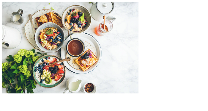
This is what our layout will look like at the end of the article.

Looks interesting? If it does, continue on.
This is where CSS Grid really shines as it allows you to place and align your grid items to your liking and it can get as complex as you like.
Things to Keep in Mind Before We Start Building the Grid
- Calculate the smallest grid
cellthat you want to have in your grid, i.e. the smallest image you want to have in your grid. - A cell is determined by the number of rows (height) and the number of columns (width) it spans.
- The smallest cell size will determine how complex your grid will be.
- Calculate the number of
columnsandrowsbased on the smallest cell
Let’s Start Building
Let’s first create a barebone HTML file that will eventually house our masonry grid. You can fork the base project from GitHub.
Let’s now look at the basic declarations.
The first code snippet contains basic CSS resets and it defines .masonry selector to display as a grid. The second code snippet contains a section that will act as a grid and will eventually contain all the grid items.
Let’s make a couple of observations here.
- We’ve set the grid
heightandwidthto be100vhand100vwrespectively so our grid takes up all the available screen size. You can customize it to your needs. - Grid columns/rows declaration:
grid-template-columns: repeat(16, 1fr)— This defines how many columns our grid will have. The repeat function lets us create multiple columns (16 in our case) with the same size.1frmeans that each of the 16 columns will have 1fraction (fr)of the available width.
The same goes for thegrid-row-columns: repeat(14, 1fr)declaration.
So, now we have a grid with 16 columns and 14 rows. You can change it according to your needs. - In our HTML file, we only have one grid cell, the
figureelement. We have nested ourimgtag under afiguretag. More on that later.
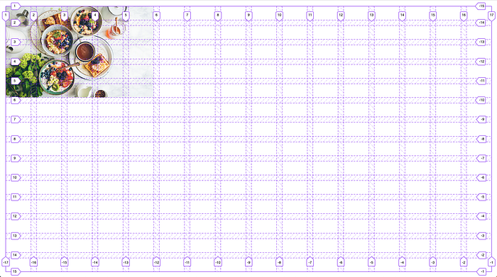
This is how our grid looks right now. The image is overlapping the grid container as the image is huge.
This is why we have wrapped the image inside a figure tag. Images don’t work well with the grid cells as they have an aspect ratio that they conform to. The figure tag will now act as the grid cell and we can set the image to adjust inside it.
Adding the above styles to the img adjusts the image to conform to the bounds of the cell.

Finally, Let’s Lay Out Our Grid Cells
Defining the grid columns and rows gave us access to the grid (column and row) tracks that we can now use to span the cell however we want.
You can visualize it better with the CSS Grid inspector. You can turn it on using this Mozilla document.

As you can see, the grid column tracks span from 1 to 17, giving us a total of 16 columns. Similarly, the grid row tracks span from 1 to 15 giving us 14 rows.
Let’s layout our first grid cell.
Now, we want our cell to span five columns wide and five columns high. We can define this using the CSS grid’s grid-row and grid-column properties.
Let’s look at the grid-column property first. We provide it with two values.
The first property defines the column track we want our cell to start spanning from and the second value defines the end. The same goes for the grid-row property.
The cell now spans five columns wide and five columns high. There are a lot of different ways to provide values to grid-column and grid-row and you can read about them on CSS Tricks.
Similarly, we can layout the rest of our cells. As a challenge, you can add more grid cells to your markup and try laying them out.
For the sake of brevity, I am including the code I wrote to build the masonry gallery I showed in the beginning.
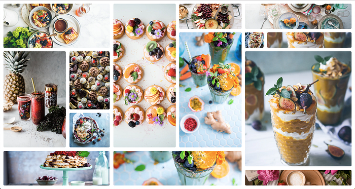
This is how the layout looks now. With the current knowledge, you can build even more complex grids. This was just an example to illustrate the basics of CSS Grids.
You can find the repo for this project on GitHub. If you have any questions, feel free to reach out to me.
That’s all, folks.

