Layouting in Jetpack Compose
Learn how to create a layout screen in Android using Jetpack Compose
Before Jetpack Compose exists, we define our layout in XML using LinearLayout, RelativeLayout, ConstraintLayout. So how do we apply in Jetpack Compose?
From my last article, we learned the basics of Jetpack Compose. In this article, we will learn how to create a layout using Jetpack Compose.
Let’s begin
We will try to create a simple app in this tutorial. Our app will consist of 2 pages :
- Home page: A page contains a list of products that can be scrolled infinitely.
- Detail page: A page showing detail of the product tapped from the Home Page.

My UI architecture in our app will look like this.

For now, we will ignore ErrorScreen and LoadingScreen as we haven’t tackled how to use API yet for Jetpack Compose. I will cover it in the future.
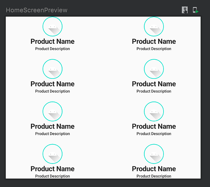
Our home page will look something like this.

Going from this, we can split them into 2 composable classes:
Product Card, containImage,Textfor Product Name, andTextfor Product Description.Home Pagefor contain numerous Product Card using Grid, This class has scroll ability to make the layout scroll.
And our detail page will look like this.

As for the detail page, we can split them into 3 composable classes:
Product Header, for containImage,Textfor Product Name, andTextfor Creator Product.Product Image Carousel, for make a carousel with contains a list of image.Product Detail Page, contains Product Header, Product Image Carousel, and description text usingText.
Let’s Begin with Home Page
Now let’s start by creating a class for Product Card. I called it ProductCard.kt.
Change the code into this:
In Jetpack Compose, instead of using LinearLayout, we use Row or Column to arrange composable functions horizontally or vertically.
Compose handles nested layouts efficiently, making them a great way to design a complicated UI. This is an improvement from Android Views, where you need to avoid nested layouts for performance reasons.
With that, we can easily arrange composable functions in ProductCard.kt. Keep in mind that we can arrange the content alignment of Row or Column horizontally or vertical.
In my case, based on my requirement, I want the content alignment in Column to be centered horizontally. So in Column I add horizontalAlignment = Alignment.CenterHorizontally .
Now, always remember to add a modifier parameter in every composable function that you create to let the external function arrange how the composable function should be placed.
That way, if I called this function, I can modify the Column modifier inside ProductCard.kt.
Now, inside Column, I use two composable functions. Image and Text.
This image will call ic_launcher_foreground in drawable resource. And we can modify the size, shape, and border with the color, shape, and thickness of the border.
For the Text, each of them is using the text, their max lines, and what to do with their text if their text lines reach the max overflow. I also modify their font size and their font weight.
In addition, I add stringResource to make them refer to string.xml in the resources file. Open string.xml and add this.
The result should be like this.

Now Product Card is ready to be implemented.
Next, we will implement Home Page. The Home Page is at the same level as Screen. So we will create HomeScreen.kt for Home Page.
Open HomeScreen.kt. Place the code like this.
So, before I explain my code, I have to remind you that because HomeScreen.kt is a composable function, you have to add a parameter modifier in HomeScreen.kt.
This will let other functions that refer HomeScreen to modify the modifier of the HomeScreen.
Before Jetpack Compose exists, we use RecycleView for enable scroll function and let view inside RecycleView recycle itself so it makes our performance app faster even though the view is a lot, making RecycleView suitable for containing a list view on a screen.
In Jetpack Compose, we don’t use RecycleView. We are using LazyColumn or LazyRow. The benefit is the same as Recycleview. The difference is LazyColumn and LazyRow is a composable function, making it suitable to implement in other composable functions.
For the requirement, because I want a grid that can scroll vertically, I use LazyVerticalGrid.
Inside LazyVerticalGrid, I made the grid become two-column, with both vertical and horizontal have a space. The content itself is 8 ProductCard that I previously create.
The result should be like this.
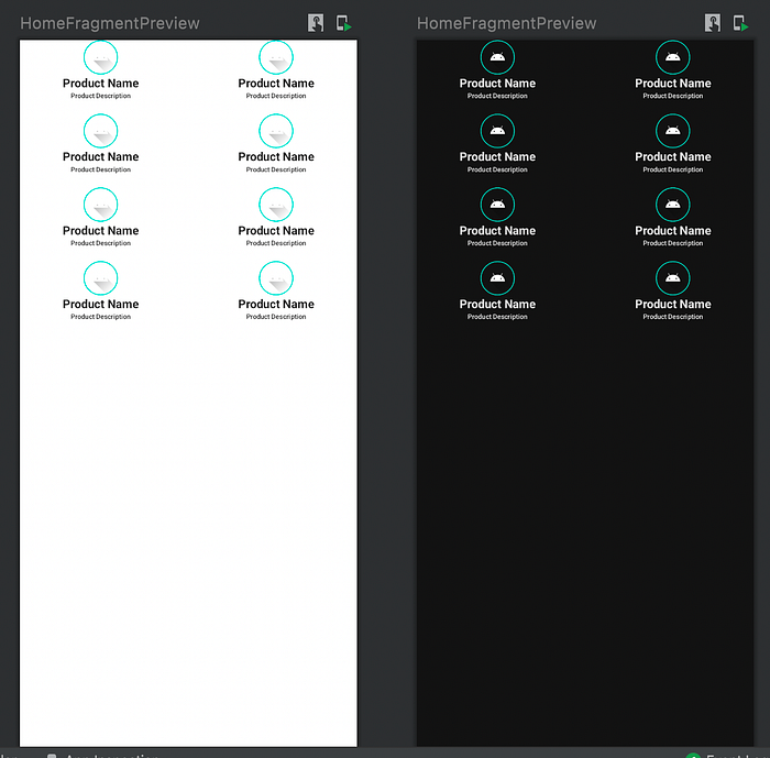
Now, based on my architecture, HomeScreen.kt is called by HomeFragment.kt. In HomeFragment.kt, I have declared a composable function called Surface.
With this function, I can use preview in Light and Dark Mode.
In addition, I use modifier.fillMaxSize() to refer their screen size to size of a device. The result in HomeFragment.kt should be like this.
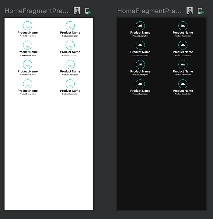
Maybe we can give a little bit of padding, we will add padding in LazyVerticalGrid at HomeScreen.kt:
Before we continue, let’s add a parameter modifier in HomeFragment.kt since HomeFragment is a composable function too.
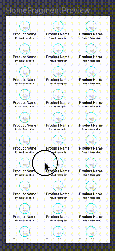
Now back to the grid, remember we can always modify how many column grids we have by changing numbers in cells.
In reality, we have different heights and weights in any device. We have to make a dynamic screen. Since right now the column grid is still static, we can change the the state of column grid into dynamic based on the weight size of a device.
There you have it. Now we can adjust the column grid dynamically if we increase or decrease the weight size of our screen device.
Now I just have to increase ProductCard count item in HomeScreen.kt for let's say 60:
Let’s look at the preview in HomeFragment.kt:
Let’s scroll it, click interactive mode or this symbol:

And our app should behave like this when scrolled:
Now Let’s Continue with the Detail Page
First, we will build a Product Header. Create ProductHeader.kt, and copy the code below.
Now you notice that there is ConstraintLayout. It is part of composable function too. To use the ContraintLayout, simply add it inside composable function too. But after that, you must put at least these codes here.
This function serves as a container for reference that is used for ContraintLayout purpose. Treat it as an id for composable function.
We just create a reference called photoAvatar, and then apply it to composable function by placing it in modifier, and then control it using linkTo.
For the better explanation about ConstraintLayout, you may refer here.
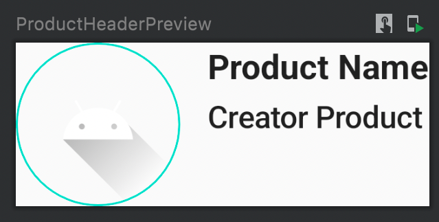
For R.string.product_creator_placeholder, the string content is Creator Product. Feel free to add this text in string.xml
Now the preview should look like this.
Next is the Product Image Carousel. Create ProductImageCarousel.kt, and copy the code below.
The end goal is to make Image Carousel, so we took the advantage by placing HorizontalPager from the accompanist library which has the ability to allow user to flip their content to the left or right. Basically, this is a carousel ability.
For reference about the pager and accompanist library, you can refer it below.
HorizontalPager currently still in experimental. Maybe in the future, there is a stable API for that. But for now, we will use @OptIn(ExperimentalPagerApi::class).
In addition, place val state = rememberPagerState() for the state inside HorizontalPager to remember the state across compositions inside HorizontalPager.
Now the preview of Product Image Carousel should look like this.

For now, we use R.drawable.ic_launcher_foreground as image.
In the future, this will change to url of image instead of painterResource. You can refer to here for more information about Pager and URL of image.
Now last but not least, Product Detail Page. Create a class named DetailScreen.kt. This will be the page for Product Detail Page. Copy the code below.
We use Column to place ProductHeader, ProductImageCarousel, and Text contain description accordingly. Since I want detail pgae have scroll ability, I will use val scrollState = rememberScrollState() and put it in Column since vertical scroll function in modifier only receive scrollstate as a parameter.
Now R.string.product_description_placeholder in string.xml, you may use long text or short text as you wish.
Now we have to make DetailFragment.kt to contain DetailScreen.kt to fulfill Fragment level.
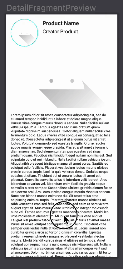
Done. You should see the preview here.
Now we have Home Fragment and Detail Fragment, each containing the respective screen.
Conclusion
By now, we have learned much about layout in Jetpack Compose.
You may refer to this link for more information about the layout in Jetpack Compose.
You may view my code on my GitHub here for the complete version.
In the next article, I will write about how to navigate from Home Fragment to Detail Fragment using Jetpack Compose.
You can view my next article here.

