Member-only story
Is There a Horizontal Scrollbar Overflow on Your Website? 10 Ways To Prevent It
Start using CSS width: 100% instead of width: 100vw and see how “viewport units” can cause scrollbars

Horizontal scrollbars are a sign of “horizontal overflow” on your sites and apps. Let’s fix it.
Here’s a CSS Riddle for You
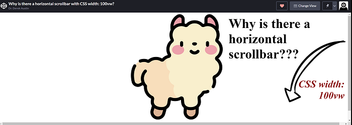
If the visible portion of a document (its “viewport”) is 100 “vw” units wide, what’s the width of 100vw?
To put it in CSS, width: 100vw should be full-screen, equivalent to width: 100%, right?
Wrong.
There’s an odd bug with CSS’s “box-sizing model” that actually isn’t a bug at all, but it’s an important thing to be aware of.
The viewport units include the space taken up by scrollbars, when present. That means they don’t work like percentage-based units normally would, causing wonky display issues.
To put it another way, CSS width: 100vw should work if you want a full-width HTML element on a website. But it doesn’t due to some rather unfortunate maths that I’ll call “viewport shenanigans.”
The horizontal scrollbars “bug” (feature?) commonly shows up when someone is used to using 100vw when building a single-page app as is common when using React, Next.js, or your favorite framework.
Let’s talk about why 100vw doesn’t work first, and then I’ll show you ten solutions to fix those horizontal scrollbars that showed up for no reason while you were trying to build a simple, full screen website.
Table of Contents
1) Add Width: 100% to All Parent Containers2) Use Position: Fixed To Anchor the Content3) Hide the Scrollbars Using Overflow-X: Hidden4) Use Width: 100vi Instead of Width: 100vw5) No Vertical Scrollbars, No Problem (Height: 100vw)6) Set a Maximum Width With Max-Width: 100%7) Use a Fixed Width With Max-Width: 100%8) Tailwind CSS: Use W-Full Instead of W-Screen9) Tailwind CSS: Use Fixed To…

