How To Use SnapKit in Your iOS Apps
Say goodbye to boilerplate auto layout code and use the SnapKit library instead

Most iOS projects nowadays gradually begin by removing Storyboard and Xib. Developers prefer to manage UI and layouts by writing constraints programmatically. It has become one of the best solutions to avoid merging conflicts, especially when working in a team.
The Auto Layout feature is available in Storyboard and Xib. It also can be written in code. Some developers prefer to use the pure API provided in Apple documentation, and others (including me) might prefer to use wrapper libraries such as Snapkit, PureLayout, and Cartography.
In this article, we are not going to discuss how to use all libraries or make a comparison. Instead, we will merely discuss the SnapKit library, focusing on how to easily learn and write the constraint correctly.
Let’s divide this tutorial into few subtopics.
- Installation
- Basic positioning (top-left, bottom-left, top with full width, center, etc.)
- Superview vs. safe area
- Padding
- Updating constraints and animation
- Using multiplier
- Attach constraint to multiple views
SnapKit
SnapKit is a powerful auto layout library with a minimal amount of code to minimize developer work in managing constraints. It is type safe by design and hence helps in reducing errors in building robust applications.
To understand how to use SnapKit, we first need to become familiar with the common auto layout in Storyboard or Xib so we will be able to properly place the constraints and avoid constraint conflicts. For example, width and height constraints should not be combined with leading and trailing or top and bottom constraints. Otherwise, it will have constraint issues.
Please take note: This article is written with SnapKit version 5.0.1. Your version might be slightly different, depending on the library updates. The syntax might have a difference as well if there’s been a major version update.
Great, let’s go through SnapKit in detail and have fun with placing constraints programmatically. First, create a new project and choose “Storyboard” with UIKit — but no worries, we are not going to touch the Storyboard until the end of this article.
1. Installation
I would suggest we use either CocoaPods or Swift Package Manager in order to easily keep getting library updates.
CocoaPods
source 'https://github.com/CocoaPods/Specs.git'platform :ios, '10.0'use_frameworks!target '<Your Target Name>' dopod 'SnapKit', '~> 5.0.0'end
Swift Package Manager
Select the Project > Swift Packages and click “+” then add https://github.com/SnapKit/SnapKit.git
2. Basic Positioning
Basic positioning includes top-left, bottom-left, top-bottom, right-bottom, top width, full width, width, height, center, center vertically and horizontally.
To have a better understanding, I would prefer to put some examples rather than going through the syntax one by one.
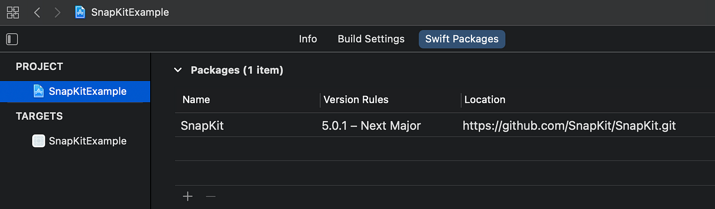
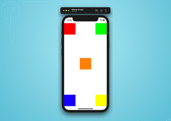
Remember, to have two constraints attach to the edge, we first need to specify the width and height. So in this example, we are going to create a few boxes and put constraints based on a few positions. See the below image that we want to achieve (four boxes with constraints at all the corners and one at the middle).
Here is the code with comments.
Always addSubview() the View before you put the constraints unless the View already inside the are UIStackView.
Right-to-left (RTL)
You will notice that I am using .leading instead of .left. Yes, keep using .leading or .trailing in your constraint so it will automatically support RTL mode and there is no need for manual View flip.
Center vertically
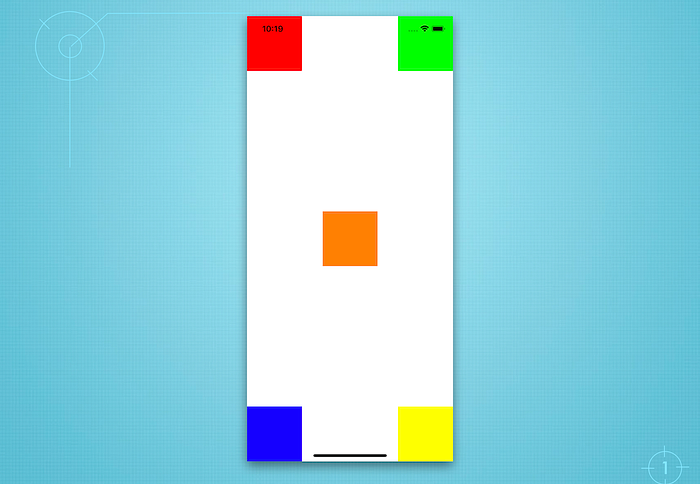
Now, how to achieve center-right or center-left? Simple! SnapKit has .centerX and .centerY so that we can combine either one or both with leading, trailing, top, or bottom. See the example below, where I modified both the red and green to be centered vertically using .centerY. You may try to center horizontally yourself.
Top with full width
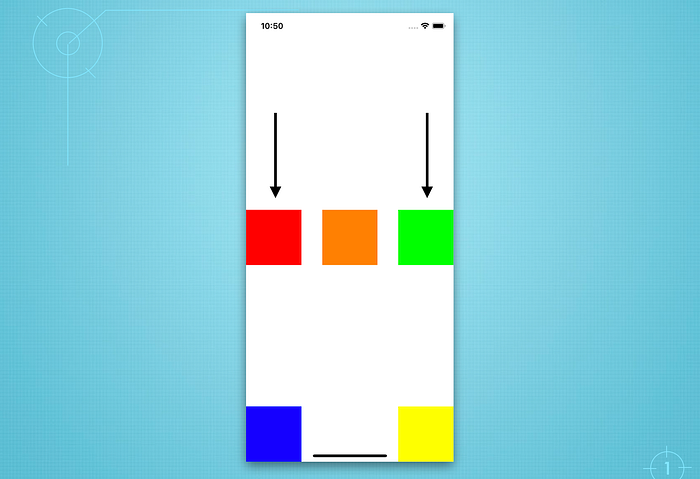
See the example below, where the orange box at the top is full width. We only need to keep the height and attach the edge to the top, leading and trailing.
3. Superview vs. Safe Area
It’s very easy to change from setting an edge from “superview” to “safe area.” Check the below example, where all boxes at the corners are moved away from the safe area.
Basically, the syntax make.top.equalToSuperview() is equal to make.top.equalTo(view.snp.top), where the view is the box superview. So, all we need is just to change the code view to the safe area syntax.
make.top.equalTo(view.safeAreaLayoutGuide.snp.top)Take a look at the updated UI and code below.
4. Padding
There are a few differences to add padding for top, bottom, leading, and trailing.
1) For top and leading padding, the value of the offset always greater than 0.
2) For trailing and bottom padding, it is always less than 0.
See the examples below, and first let’s divide padding into two common usages.
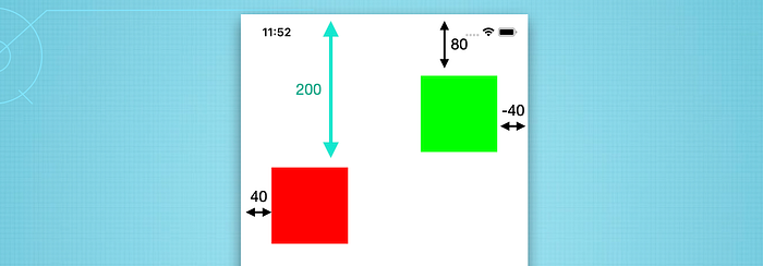
Top-left and top-right
We are going to add an offset (padding) of 80px for .top and 40px for .leading to the red box. Also, for the green box, we will add 80px for .top and 40px for .trailing. See the difference? It’s only the trailing padding that has -40px in its value.

Bottom-left and bottom-right
As explained above, the bottom and trailing offsets always have a minus value for the offset.

Great. Now, we have learned how to add padding for those four sides.
Again, take note that for the safe area, we just need to replace the equalToSuperView() with equalTo(view.safeAreaLayoutGuide.snp.top).
Leading and trailing with inset()
Another trick in SnapKit to set leading and trailing together. Instead of using offset(x) and offset(-x), we can use inset() in one row.

5. Updating Constraints and Animation
In SnapKit, updating a constraint is quite simple. We don’t have to maintain a variable. We only have to ensure that:
- The constraint is already added before (exists). Otherwise, SnapKit will throw an error updating a non-existent constraint. Then we can use the SnapKit API to make the changes within the closure.
- Only update the related constraint — no need to rewrite them all.
Update constraint
See the example below for how to move a bit lower by adding more offset. We are going to update only the top constraint to 200px.
Animate constraint updates
Wrap the changes in the animate() closure and call the layoutIfNeeded().
Wow, that’s easy!
6. Using Multiplier
The multiplier is related to width or height with the ratio of the parent view or another view. For example, we are going to make the width of the red and green box half of the main view width (multiplier = 0.5) using multipliedBy(). The result will be similar to the example below.

7. Attach Constraint to Multiple Views
This is a very useful subtopic where, in a real scenario, one view may attach to multiple views with a certain padding size.
However, you may notice that in this example we are using UIStackView to wrap some views with spacing. It makes our code much cleaner and easier to manage, especially when we need to perform rapid changes. To have a quick preview, you may try to use UIKit preview, as explained in this tutorial.
See the below result that we are going to develop with the code.
Awesome! We have covered all essential features in SnapKit. You may try to implement it in your projects gradually, scene by scene.
Hopefully, this article will help you improve your development skills. Thanks for reading. Feedback is most welcome. Happy coding!
“Learn, that’s how we grow our coding skills.”


