How To Toggle Dark Theme With Ant Design 5.0
Boost your users’ experience with this simple toggle
Ant Design has supported dark theme for a while now, and it wasn’t easy to switch between light and dark themes. You’d have a few components supported out of the box, and you’d have to use libraries like @callstack/react-theme-provider to switch between different CSS files. Lucky for us, Design 5 makes life so much easier.
Let’s Get Started
Step 1
You’ll need a react app running with the Ant Design 5.0.0 or above.
To install antd, use npm i antd .
Step 2
Go to the App.js file in your React app and import the following:
import { useState } from "react";
import { ConfigProvider, theme, Button, Card } from "antd";
Step 3
Use theme provided by AntD to destructure and use the different theme algorithms provided by AntD. AntD provides darkAlgorithm, compactAlgorithm, and defaultAlgorithm, but for our use case, we’ll only be using darkAlgorithm and defaultAlgorithm.
const { defaultAlgorithm, darkAlgorithm } = theme;Step 4
Create a state to track the theme we’re currently using and toggle themes. Ideally, you should be using some state management for this, but for our use case, useState() gets the job done.
const [isDarkMode, setIsDarkMode] = useState(false);Step 5
Wrap your app component with ConfigProvider that we imported from AntD. This allows us to choose which algorithm to use and customize the theme to our liking.
return (
  <ConfigProvider>
    ...
  </ConfigProvider>
);
Step 6
Let's create a component whose theme we will change by adding a toggle button.
return (
  <ConfigProvider>
    <Card style={{ width: "max-content" }}>
      <Button>
        Change Theme to {isDarkMode ? "Light" : "Dark"}
      </Button>
    </Card>
  </ConfigProvider>
);
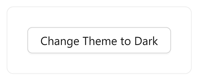
As you can see, Antd’s ConfigProvider uses defaultAlgorithm, which is the light theme.
Step 7
We can now use the options provided by ConfigProvider to switch between themes.
return (
  <ConfigProvider
    theme={{
      algorithm: isDarkMode ? darkAlgorithm : defaultAlgorithm,
    }}>
    <Card style={{ width: "max-content" }}>
      <Button>
        Change Theme to {isDarkMode ? "Light" : "Dark"}
      </Button>
    </Card>
  </ConfigProvider>
);
We’ll be changing the theme based on if isDarkMode is true or false.
Step 8
Although we created a state to keep track of the theme, we don’t have a way to change that state, so let’s create an onClick handler that takes care of that.
const handleClick = () => {
  setIsDarkMode((previousValue) => !previousValue);
 };
And then add the handler to the onClick of the Button.
return (
  <ConfigProvider
    theme={{
      algorithm: isDarkMode ? darkAlgorithm : defaultAlgorithm,
    }}>
    <Card style={{ width: "max-content" }}>
      <Button onClick={handleClick}>
        Change Theme to {isDarkMode ? "Light" : "Dark"}
      </Button>
    </Card>
  </ConfigProvider>
);
And now you are done!
End Result
At the end of it, your App.js should look something like this:
import { useState } from "react";
import { ConfigProvider, theme, Button, Card } from "antd";
function App() {
const { defaultAlgorithm, darkAlgorithm } = theme;
const [isDarkMode, setIsDarkMode] = useState(false);
const handleClick = () => {
setIsDarkMode((previousValue) => !previousValue);
};
return (
<ConfigProvider
theme={{
algorithm: isDarkMode ? darkAlgorithm : defaultAlgorithm,
}}>
<Card style={{ width: "max-content" }}>
<Button onClick={handleClick}>
Change Theme to {isDarkMode ? "Light" : "Dark"}
</Button>
</Card>
</ConfigProvider>
);
}
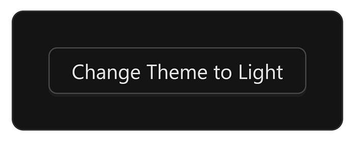
export default App;Now, whenever you click on the Button, you should be able to toggle between light and dark themes.
Over the years, I’ve been a fan of Ant Design, but I never really liked how they handled switching between themes until now. Ant Design 5 makes it super easy to switch themes and customize them to your liking.
To read more about customization, check out the docs.
I hope this helps!

