How To Present a Bottom Sheet View Controller in iOS
A simple and easy approach with no library needed
A bottom sheet modal view controller is a feature that has a great UI/UX design. It is very useful when we want to present a quick preview with minimal content. In fact, in most iOS implementations, it has a pan gesture feature (draggable) to simply dismiss the controller or expand the content by dragging the view to the top or bottom. The modal view controller can also be quickly dismissed by tapping the dimmed background.
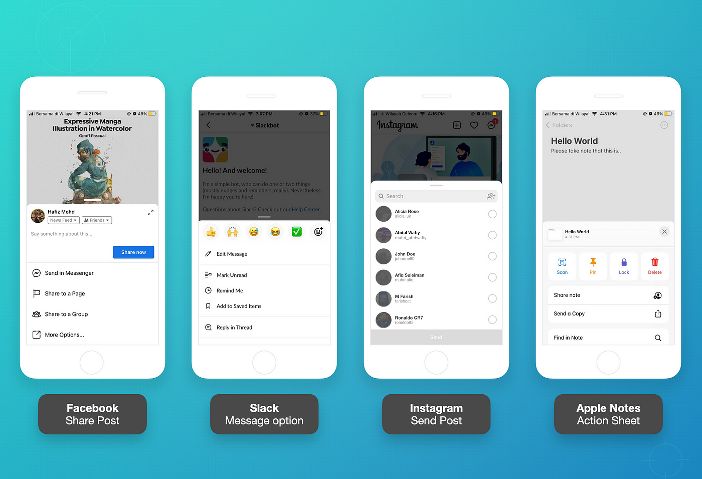
This feature is currently implemented in many well-known apps such as Facebook, Slack, and Instagram.
What Will We Build?
In this article, we are going to create a simple app (shown above) with a modal view controller that has the following capabilities:
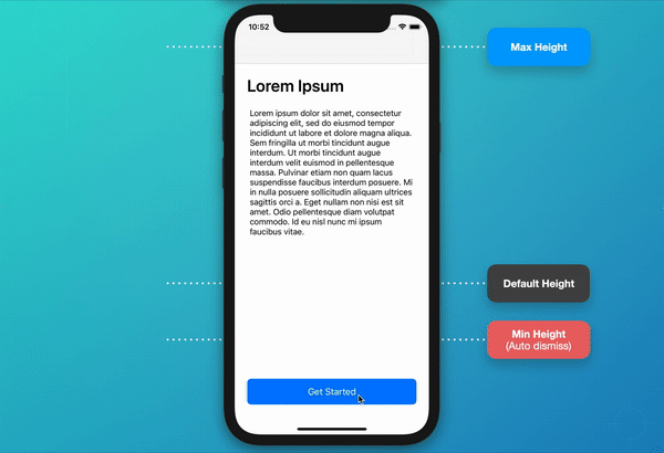
- Can be presented modally with the content size taking up around half of the screen size or less (customizable).
- Able to drag down to dismiss the view controller (using pan gesture recognizer).
- Able to drag up to expand the view controller.
- Able to dismiss the view controller by tapping on the dimmed background.
I assume everyone reading this is already familiar with Auto Layout and modifying constraints. In addition, we will build this programmatically, including creating views and setting up the layout constraints.
However, you may use Storyboard, Xib, or other Auto Layout libraries. But make sure to focus on which constraints will have the changes and affect the layout throughout the tutorial.
1. Create New UIKit Project

Create a new project with UIKit and Storyboard. However, we are not going to update the Main.storyboard file, as we will create the whole thing programmatically in a Swift file.
Remove Storyboard (optional)
You may completely remove the Storyboard with the following extra steps:
1. First, remove “Main” from Project > General > Main Interface.
2. Open Info.plist file as a “Source Code” and remove these two lines:
<key>UISceneStoryboardFile</key>
<string>Main</string>
3. Then, delete the Main.storyboard file from the project.
4. Add the code below to theSceneDelegate.swift to set up our root Window from the specified View Controller.
2. Adding Views to ViewController
In this project, we will be working on two main view controllers:
ViewControlleralready exists inViewController.swiftas a main page.CustomModalViewControlleris a presentable view controller that we will create in the next step.
Now, open ViewController.swift and we are going to add some text and a button that are wrapped in UIStackView. This button will trigger a function to present our custom modal view controller.
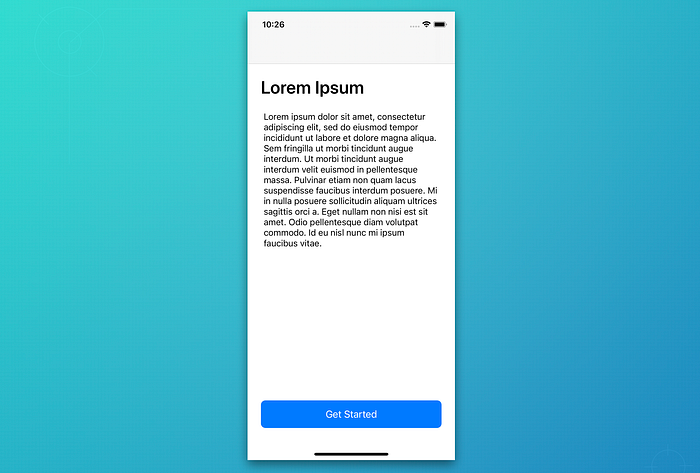
Update your ViewController.swift file with the code below and run the project (command + R). You should be able to see the same results as shown in image above.
Below is an explanation of each important point added in the view controller:
- Add all the needed UI components, including
UILabel,UITextView, andUIButton, inside aUIStackViewwith the lazy closure and define the styles. We are not setting the frame or size because it will be handled in the constraints setup in the next steps. I also added aspacerinside thecontainerStackViewto push theregisterButtonto the bottom of the screen. - Our common
viewDidLoad()to call all the setup methods. - Bind an action method to the
registerButton. - The
setupConstraints()method is where we add necessary subviews and set up the constraints. I think the constraints are quite straightforward, although they are written programmatically. - Wrap all the constraints needed in the
activate()function to immediately update the layout of each view. - Set the
containerStackViewedges (top, bottom, leading, and trailing) to superview with 24px spacing. - Set the button height to 50px.
- Prepare a
presentModalController()method that will be called when we tap on theregisterButton.
Great, now we are done with the first page. Let’s proceed to create our second view controller.
3. Create CustomModalViewController
Create a new controller called CustomModalViewController (you may use any suitable name). Then add a UIView called containerView as the main view to hold subviews of UI components. The image below shows the second view controller that we are going to build in this step:

In the initial stage, we will create the CustomModalViewController with an empty view and without animations. Below is the code that will update the view controller:
- Create a
containerViewas the main place to keep the content later. - Create a simple
dimmedViewas a back dimmer. - Create dynamic constraints that are subject to be changed based on animation and
containerViewheight. - Add
dimmedViewandcontainerViewas main subviews. - Set the static (unchangeable) constraints.
- Set the container height to default (300px).
- Set the bottom anchor of the
containerViewto0so the view will be visible from the bottom edge to 300px height.
Then, update the presentModalController() method in ViewController.swift as shown below:
We are not using present() with animation as shown in the code above. Thus, we should set animated value to false. Instead, we will add our custom animations to animate the dimmed background and container movement.
Now, if you run the project and click the “Get Started” button, it will show our new view controller without any animation yet.
4. Present Container View With Animation
Add a new method called animatePresentContainer() that will present the containerView from bottom to default height. In setupConstraints(), make sure to change the initial bottom constant to defaultHeight (300px) so the containerView will initially hide below the bottom edge.

It is important to always keep in mind that if the bottom anchor is equal to 0, the containerView will visible. If the bottom anchor is greater than 0, it will be slightly hidden based on the offset value.
This new method needs to be called from viewDidAppear().
5. Adding Dimmed View Animation
Add a new method called animateShowDimmedView(). Then make a simple fade animation by updating the alpha value, as shown in the code below. This method will also be called in viewDidAppear() with animatePresentContainer().
6. Adding Custom Dismiss Animation
In this step, we are going to imitate the view controller dismiss animation. First, add a new method called animateDismissView(). It is used to hide the dimmed view and move the containerView below the bottom edge. At the end of the animation (in the completion closure), it will call the native view controller’s dismiss() method without any animation.
Once this is completed step, our app should be able to smoothly present the bottom containerView along with a fade dimmer animation when the “Get Started” button is pressed. Also, you should be able to dismiss the view controller by tapping on the dimmed view.
7. Set Up Pan Gesture To Detect Dragging Movement
This part is important because we want to capture the distance of the offset value while panning on the containerView.
1. Add a new method called setupPanGesture() to set up the gesture on the main view and bind it to the handler method.
2. Create a handler method called handlePanGesture(). For better understanding, let’s do a simple printout to capture the dragging distance and direction:
3. Now, call the setupPanGesture() in viewDidLoad().
Run the project and try panning the containerView. When checking the bottom output logs, it should print a similar result to what is shown below:
Pan gesture y offset: -20.666671752929688
Dragging direction: going upPan gesture y offset: -14.333343505859375
Dragging direction: going upPan gesture y offset: -3.6666717529296875
Dragging direction: going upPan gesture y offset: 9.0
Dragging direction: going downPan gesture y offset: 14.333328247070312
Dragging direction: going downPan gesture y offset: 22.666656494140625
Dragging direction: going down
8. Update Gesture Handler
From the result in the previous step, we know that if the drag direction goes up, the Y offset is always minus — and vice versa. Therefore, in order to update the containerView with the new height, we should implement this formula:
newHeight = containerHeight + (-translation.y)As a result, when we drag to the bottom, the container height will become smaller. When we drag to the top, the height increases. Perfect!
Expand and dismiss conditions
Remember that we have determined the value of our condition.
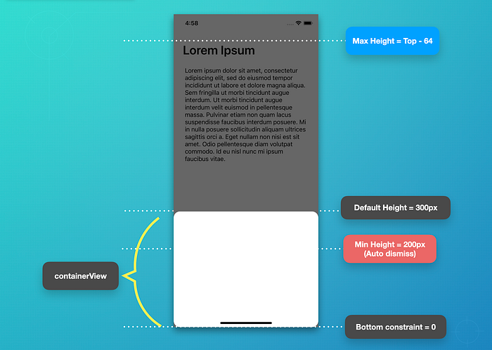
- Default Height: Fixed default size of the container
- Maximum Height: The maximum value that the container can present or be dragged. Whenever the
containerViewis dragged to the top from the default height (300px), whether the user releases or not, thecontainerViewwill keep growing to the top (cannot exceed maximum height). - Minimum Height: If the container reaches the minimum value or goes lower than that, the view will be automatically dismissed. It is similar to a “swipe down to dismiss” action.
Now, add some let constants for the fixed values and also a var to keep the changes to the container’s height.
Then, update the handlePanGesture() based on the gesture state and add a new animateContainerHeight() method to update the new container height with animation. The height of the container is updated based on the dynamic constraint variable called containerViewHeightConstraint. See the comments in the code for a detailed explanation:
9. Adding Content to Container View
This step is optional if you want to see the content changes when the containerView is expanding or shrinking.
We are going to add two labels and a stack view, then set the constraints of the stack view to the edge of the superview (containerView).
Project Completed
Congratulations! Now, we have completely done all the steps and the project is ready to run. We have written a very minimal code and the custom modal view controller is working nicely.
The complete source code can be downloaded from my GitHub repository. Try to implement it into your projects and improve the code by creating a wrapper class that will be reusable in other view controllers.
Thanks for reading. Happy coding!
WWDC21 Update
According to the latest session in WWDC21, Apple has released an update to the UIKit to have a customizable and resizable bottom sheet called UISheetPresentationController which is available on iOS15+. This update is definitely a long-waiting feature for every developer.
References
- https://developer.apple.com/library/archive/documentation/UserExperience/Conceptual/AutolayoutPG/index.html
- https://developer.apple.com/library/archive/documentation/UserExperience/Conceptual/AutolayoutPG/ProgrammaticallyCreatingConstraints.html
- https://fluffy.es/facebook-draggable-bottom-card-modal-1/
- https://github.com/xmhafiz/CustomModalVC
- https://developer.apple.com/videos/play/wwdc2021/10063/
- https://developer.apple.com/documentation/uikit/uiviewcontroller/customize_and_resize_sheets_in_uikit?language=objc
- https://developer.apple.com/documentation/uikit/uisheetpresentationcontroller?changes=_2_1&language=objc

