Member-only story
Coding
How to Position Background Images With CSS
Use background-position to adjust the image’s position
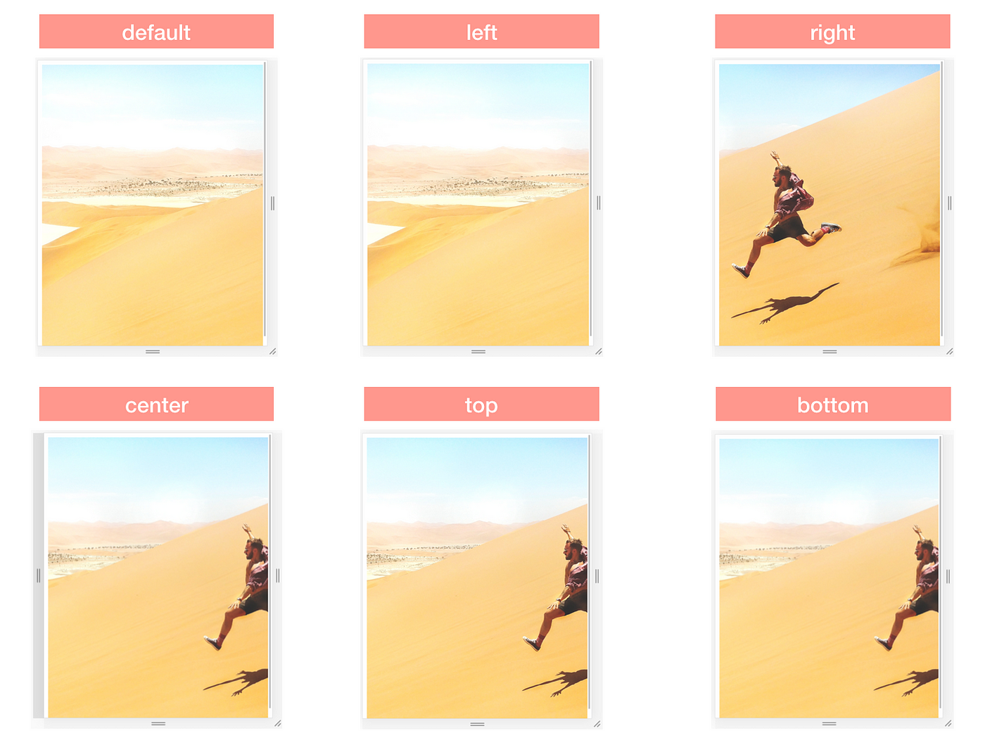
I’d like to share with you how to position a background image (rather than leave its position to the browser where it will crop the image in the direction from the right, and from the bottom by default).
For this piece, I’m using a landscape picture with a man in the foreground as the focal point. The image is added as background-image, with the CSS property of background-size: cover. It will thus be re-sized to cover the entire container.
Depending on the size of the container, the image will be stretched or cropped.
I will be using the photo below to show how to position a background image on a webpage. The intention is for the image to cover the entire webpage, be it on mobile or desktop.

The Image on Different Screen Sizes (As Seen in Chrome Developer Tools)
The image above looks great on a large laptop. It looks slightly stretched when I compare the original image with how it is rendered in a browser (as below).
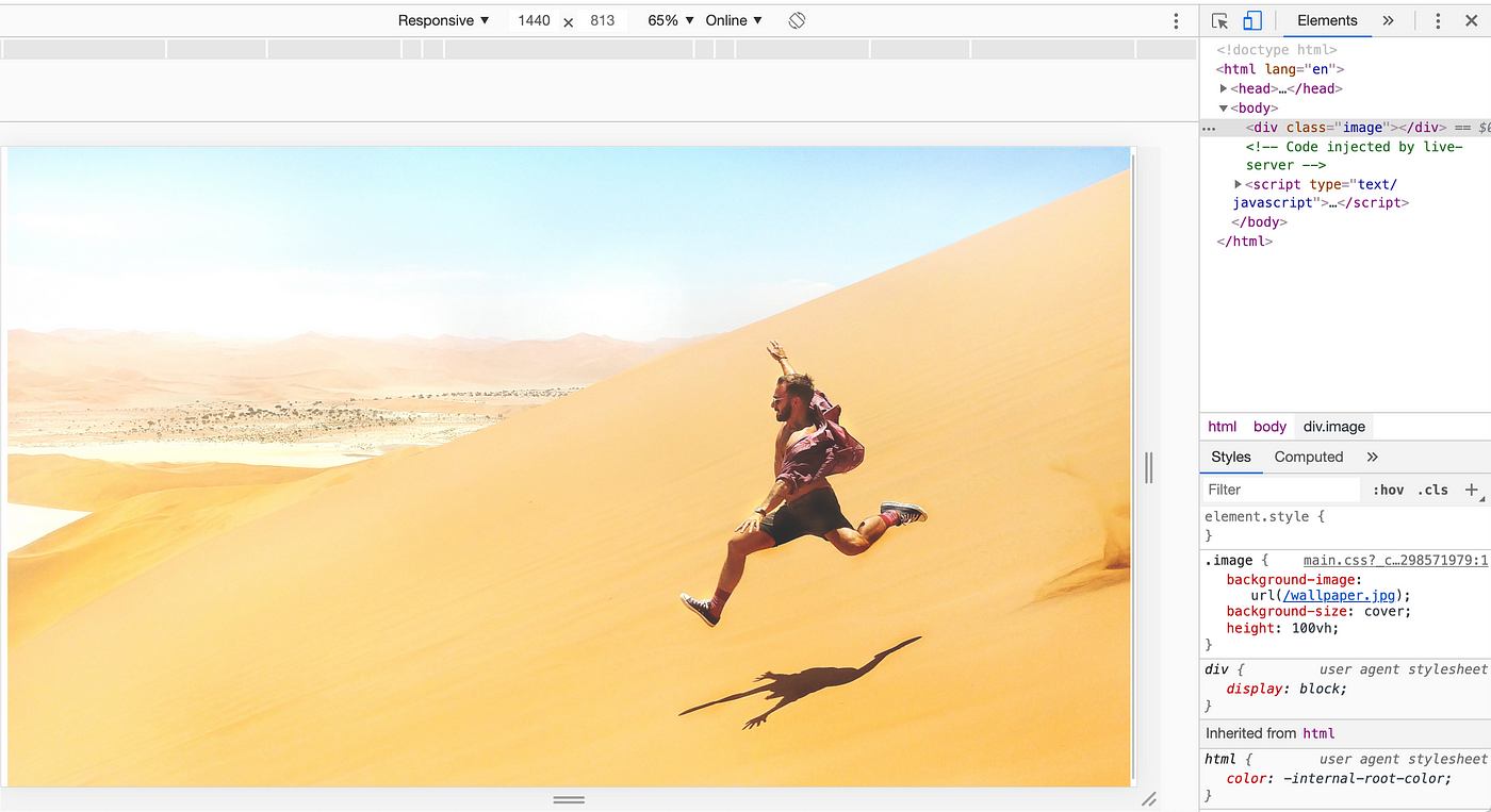
On a small laptop, although the image is cropped from the right, the man in the picture is still visible. However, on a mobile, he’s completely cropped out — not what was envisioned by the designer.

How can I position the image so the man in the picture remains the focus?
Approach
A quick fix would be to crop the images using an image editor and then display the right image based on screen size.
The other way would be to use CSS — that’s what I’m using here.

