How to Implement the Drag-and-Drop of Files in React
Creating a custom and reusable area to drag and drop files
Heyo, geeks!
When it comes to uploading files, we can, of course, easily handle it with the default <input type='file'/>. But I’m pretty sure most will agree it’s much comfier to drag and drop your files into the web page rather than searching for them in the file-dialog window.
Therefore, let’s figure out how we can easily create an area in React for the dragging and dropping of files.
Handle File Uploading
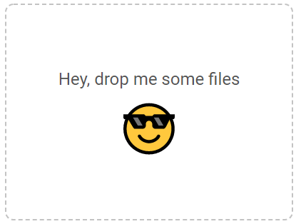
First, let’s create a basic project structure and styling.
App.js
FilesDragAndDrop.js
FilesDragAndDrop.scss
This is what we’ve got so far.
Now, let’s add some logic.
Create a ref for the drop area:
Add listeners for the drop and dragover events, and prevent their default behavior (opening the dropped file):
Basically, to get things working, we only need to check if the dropped element contains files and to pass them to our parent component.
Hurray! Our drag-and-drop component is working.
Now when we receive dropped files in the parent component, we can do whatever we need with them (e.g., pass them to some API endpoint).
But it’s definitely not exactly how we’d like our drag-and-drop component to work. So let’s make some essential improvements.
Customize Content
One of the main React best practices is the reusability of components.
That’s why it’d be better to provide content for the drag-and-drop area from a parent component. Our drag-and-drop component will serve as a wrapper, and we’ll be able to reuse it anywhere.
So instead of some hardcoded content, we’ll render the children prop inside our component:
While using the component, we need to wrap it around some custom content:
Validate File Formats and Count
Like any other input (whether it’s a number, date, or file), we may need to validate the entered data. In some cases, we should only allow the uploading of certain file formats. In other cases, we’ll need to limit the number of files that can be uploaded at a time.
While in the default <input type="file"/>, we can validate formats using the accept parameter and validate the number of files using the multiple parameter. In our custom component, we need to handle validation manually.
To implement it, let’s add new count and formats props to our component and handle them inside the handleDrop function:
That’s it! Now our component will prevent uploading files with the incorrect format or quantity.
Last but Not Least — UI/UX
Overlay on dragover
When users interact with a system, they always expect some feedback — i.e., when files are dragged over the drag-and-drop area, it’d be nice to show an overlay with a message confirming the user is doing everything right.
To handle dragging over the area, we need to do the following: Add a dragging parameter to the state, and handle dragenter and dragleave events (enable dragging when a dragged file is entering the area, and disable when it’s leaving it):
If dragging is enabled, show an overlay above the area:
When you implement it, you may notice something’s wrong:
This happens because once the dragenter event is fired, we show the overlay above the content. Therefore, the content loses drag and fires the dragleave event while the overlay catches the drag and fires the dragenter event. This causes the endless changes of the dragging flag.
But it’s pretty easy to fix. We just need to check whether the event is fired from the overlay or not. If the dragenter event isn’t fired from the overlay, we need to show it, and if the dragleave event is fired from the overlay, we need to hide it.
Add the ref for the overlay:
Then check if the event target is equal to the overlay:
Also, don’t forget to reset the dragging flag on the drop so it won’t affect the next dragging file:

Message about successful upload or validation error
The last thing we need to implement is the info message when files are successfully uploaded or when they didn’t pass the validation.
Let’s add the message parameter to our state and the function that’ll handle it:
During the render, we’ll check the message parameter and display the appropriate message, if needed.
When it’s done, we can invoke the showMessage function anywhere we need:
Here’s what we’ve created.

Conclusion
Before you start implementing your own drag-and-drop, I want to share some good news with you.
I created the npm package for this component with even more cool stuff, such as TypeScript, a file dialog window on click, text and style customization, etc.

