Member-only story
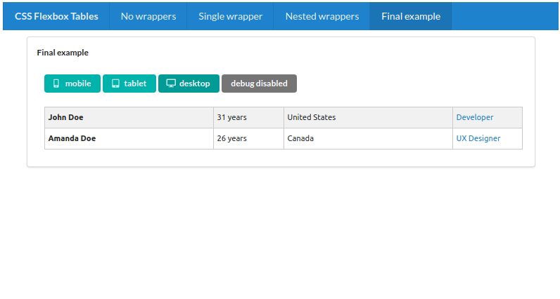
How To Create Responsive Tables With Flexbox and React
With some CSS and a small collection of simple React components, you can easily customize responsive tables

Popular frameworks like Bootstrap and Semantic UI all have components that you can use to create responsive tables or grids. But there are downsides to using those solutions. First of all, they’ll force you into using these frameworks — or at least parts of them — in your applications, with all the overhead that’s caused by that.
Even more importantly, it’s not always easy to customize the behavior of those out-of-the-box components.
Today, I’ll show you that it’s not hard to create responsive tables from scratch. With a bit of CSS (Flexbox), some media queries, and a handful of very simple React components, you can create any table you want, and it will change shape on every breakpoint in the way you want. You’ll have full control.
On top of that, it will be a great exercise.
And with a lot of animated GIFs, there is little that’s stopping you from reading on. Enjoy!
Flexbox Basics
Creating a single row with some cells (some people prefer to call them columns, but I’ll stick with cells throughout this article) is quite straightforward.
In the image above, you see a row (a DIV element) containing four cells. The row is a Flex container:
display: flex;
flex-direction: row;
And we have defined two types of cells:
- Growing cells (A and C)
- Fixed-width cells (B and D)
The fixed-width cells have a width of 100 pixels, and this never changes. The growing cells are Flex items. Together, they take up all the available width, and without specifying otherwise, they’ll divide this available width equally.
The relevant styling:


