How To Build an Online Searchable Dropdown Flutter Widget
Implementing a customizable dropdown with online-offline data in Flutter
There are a couple of widgets in Flutter that provide dropdown search functionality, but the one I found truly amazing is:
DropdownSearch<>This widget allows you to do the following:
- Create a dropdown list of items.
- Search the data provided (both complete and incomplete search functionalities).
- Set data so it is an offline list built by you, or it can be online data that can be fetched through an API request.
- Customizable pop-up builder. Text, styling, and decoration of the pop-up data list.
- Customizable dropdown item builder. Text, styling, and decoration of the pop-up dropdown list.
As the first step, include the widget class in the list of dependencies in the pubspec.yml file of your Flutter project.
pubspec.yamldependencies:
   dropdown_search:
Use Cases
This widget is like a tool, like a hammer, so you need to know under what circumstances this tool should be used:
Case 1
- You want to implement a searchable dropdown and the data is being created offline.
- Offline means that the data is being created inside the code without any calls to an API.
Case 2
- You want to implement a searchable dropdown and the data is being fetched online.
- Online means that the data is being fetched from an API through an HTTP request.
- You don’t want online filtering.
- You are working with a
FutureBuilderand you want to pass the future variable to the Dropdown Search widget.
Case 3
- You want to implement a searchable dropdown and the data is being fetched online.
- You want online filtering which supports searching keywords.
- Now, as online filtering is enabled, you have an API request that you want to connect with this widget.
In this tutorial, I am explaining case 3. This is the most complex case. In my next tutorials, I will also explain cases 1 and 2.
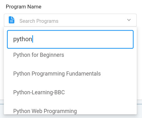
How the UI Will Look Like After Implementing the Dropdown Search in Case 3

The snapshot is from my personal project. You can see how the search bar appears over the list and how the whole widget can be styled. This is our motivation for using the widget.
What Every Parameter Means in the Widget Class?
The widget code — that lets you create an online search with filters — is given below:
DropdownSearch<Class>: TheClassis theClasstype of the list items that you want to have in the dropdown. You can create a customClassin your code or if the list has a class type that is already available in Dart, for example, String, int, or bool, you can write those in place ofClass. This is very important because you have to decide beforehand which type of items you want to include. The same type of items will be returned by thegetData()method inonFindparameter. The same class of object will be given byonChanged()method.mode: refers to the type of pop-up you want to create on pressing the widget. You can choose from three options ofMENU,DIALOGorBOTTOMSHEET.showSearchBox: should be true if you want a search function.isFilteredOnline: should be true if you want a filter to be applied to the online data. This means that whatever you write in the search box will be sent to an API online to fetch data accordingly. This field is linked toonFind, which is discussed later in this tutorial.dropDownButton: If you see the UI snapshot, you will see a small arrowhead facing down on the right side. This indicates you can expand the list. The icon widget is given to this field. You can put any icon here, but it has to be an icon.dropdownSearchDecoration: This field is for the styling of the dropdown widget. The horizontal rectangular box in which there is a building icon and Search/University Store is written, due to this field. This field accepts anInputDecorationclass . What an Input decoration class is and what its properties are can be studied on Flutter’s documentation on InputDecoration.dropdownBuilder: This controls how the dropdown looks after the item selected from the dropdown gets displayed. I usedListTileto display text. The_customDropDownProgramsis implemented as follows:
Here, the item is the object selected from the list and the field knows which object you select, hence it takes a method that returns a ListTile . If item is non-null (object selected), it uses that selected item and takes the title attribute from it. The item here is a custom implemented class object of the class BootCampDetails. You can create your classes and attributes to put here. It shows “Search Program” if item is null (nothing is selected).
8. popupItemBuilder: This field controls how the items displayed in the popping dropdown are styled. You can change the text, color length, and size or even add leading icons. All these properties are provided by the ListTile widget. You can also add explanatory subtitles to every item title and more. Learn more about this widget on the Flutter documentation about ListTitle. The _customPopupItemBuilder is implemented as follows:
isSelected is useless over here. It is used for pre-selection, which is not used in most cases, but you have to put it in the function parameters.
9. onFind: This is the most important method because the data is given over here. The onFindggives us a String type Filter that can be used by us. Filter stores whatever we write inside the search box even when a single letter is typed and onFind is triggered. Then, filter becomes useable. I have passed filter as the argument to getData() which makes the online request to an API using the filter string. You need to implement a similar method that returns a Future List. This is very important because onFind requires a future list type object and nothing else. getData() is implemented as follows:
Line 10 is where we set the filter as a value to the key searchText. This is sent in the body of the request. This is according to the specific API I am using to fetch data. After that, the detailList is converted to List and returned. This method fetches data every time you write something in the search box; hence it gives real-time data fetching.
10. onChanged: The second most important parameter is this. After you select something from the dropdown, the code written in this param gets executed. The onChanged field provides us with the selected Object. You can do whatever you want with this object. Maybe store it and use it somewhere else. setState() can be called from anywhere inside the code. I called it here to meet my specific requirement. Also, it's common practice to call setState as you can save the selected object and maybe display it somewhere on the UI.
showClearButton : If true, a small clear button will be shown to the right of the selected object. It is used to clear the widget and reselect something.
UI snapshots:

I will be writing another detailed tutorial about widgets used in Flutter.
Want to Connect?Hit me up on LinkedIn.

