Introducing GridPad — Jetpack Compose Layout for Grid-Based UI
GridPad is a Jetpack Compose library that helps to create grid-based UI more naturally and conveniently

Probably, each developed is faced with a task to implement grid-based components such as pin pads, calendar cells, and stuff like that. Of course, the standard Jetpack Compose library allows you to implement everything that you need by the Row and Column combination. The problem with the Row and Column combination is the unnatural control of row and column sizes.
In addition, it may not be very convenient to work with Row and Column spans. To avoid noticed problems, we made GridPad — Jetpack Compose layout for grid-based UI. So, let’s see GridPad in action.
Get Started
First, add the dependency below to your module’s build.gradle file:
To implement the simplest grid, everything that you need is to write a few lines of code:
The code above initializes a 3x4 grid with rows and columns weights equal to 1. That means that GridPad takes parent bounds and distributes them evenly between rows and columns. For that reason, GridPad has to limit from both sides: horizontal and vertical. It is not allowed to put it into infinity layouts. The result of the code above will look like the following:

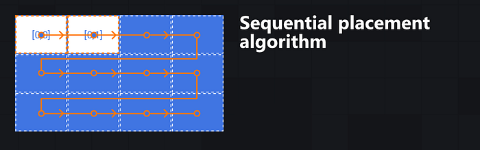
To place content into the cell, you should wrap it with item. Items in a GridPad can be placed explicitly and implicitly. In the example above, items are placed implicitly. Implicit placing placed the item next to the last placed item (including span size) in the same row. The first place will be at position [0;0].
When an item is placed at the last column in a row, the next items are placed at the next line from the first column.
Define the Grid
Specifying the exact grid size is required, but specifying each row and column size is optional. To define a specific size for a row or column, you need to use GridPadCells.Builder API. Here’s how to do that:
The library support two types of sizes:
GridPadCellSize.Fixed— fixed size in dp, not change when the bounds ofGridPadchange.GridPadCellSize.Weight— a relative, depends on other weights, remaining space after placing fixed sizes, and theGridPadbounds.
The code above will draw the following:
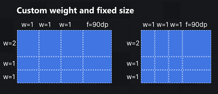
The algorithm for allocating available space between cells:
- All fixed (
GridPadCellSize.Fixed) values are subtracted from the available space. - The remaining space is allocated between the remaining cells according to their weight value (
GridPadCellSize.Weight).
Place the Items
To give more flexibility in controlling the drawing order and placement, the contents of each cell should be wrapped with an item. To place an item explicitly needs to specify one or both properties row and column in the item. When defining row and column properties, it's also possible to place all items in a different order without regard to the actual location.
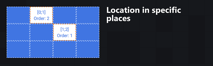
If the placement reaches the last row and column, the following items will be ignored. Placing items outside the grid is not allowed.
When specified, only one of row and column properties, the logic will be the following:
- If the
rowproperty is skipped, the row will be equal to the last placed item's row. - If the
columnproperty is skipped, the row will be next after the last placed item (including span size). When the last item is placed at the last column in a row, the next items are placed at the next line from the first column.
A cell can contain more than one item. The draw order will be the same as the place order.
GridPaddoes not limit the item’s size when the child has an explicit size. That means that the item can go outside the cell bounds.
Spans
By default, each item has a span of 1x1. To change it, specify one or both of the rowSpan and columnSpan properties of the item. Overlapping elements are also allowed.

When an item has a span that goes outside the grid, the item is skipped and doesn’t draw.
When you have a complex structure it’s highly recommended to use an explicit method of placing all items to avoid unpredictable behavior and mistakes during the placement of the items.
Conclusion
Now you know one more library to make your development more productive. More examples you can find in the example application in the library repository:

