Getting Started With Tailwind CSS
A utility-first CSS framework for rapidly building custom user interfaces
Writing long lines of CSS can sometimes be time-consuming, exhausting, and frustrating, which is why you should choose the right framework for the job.
In this article, you will learn how to install and set up Tailwind in your projects. But before diving into the project itself, let's get a brief understanding of what Tailwind is.
What Is Tailwind CSS?
According to the official website, “Tailwind CSS is a highly customizable, low-level CSS framework that gives you all of the building blocks you need to build bespoke designs.”
Tailwind doesn’t come up with pre-designed components like in bootstrap. Instead, it provides low-level utility classes where you can build your site with custom designs instead of having a hard time overriding opinionated styles.
To use Tailwind CSS, you should have a basic understanding of CSS.
Note: Tailwind classes are just shorthand versions of CSS properties/values, so if one has no prior knowledge of CSS, they should not use Tailwind.
Let's Get Started
Project details
For this project, we will make a simple single-page static site using Tailwind only.

Installation
In this project, we will install Tailwind CSS via Node Package Manager (npm), but you could also use the CDN. If you choose the latter approach, you will not be able to use some features like extracting custom CSS classes. But if you just want to give it a spin, then go for it.
/* Tailwind CSS CDN */<link href="https://unpkg.com/tailwindcss@^1.0/dist/tailwind.min.css" rel="stylesheet">
To install Tailwind, we will first create a folder:
$ mkdir mytailwindcsssiteNow, change to the newly created folder and initialise npm to install Tailwind:
$ cd mytailwindcsssite$ npm init -y
After initialising npm in the folder, a package.json file will be created. Now we can install the tailwindcss package easily by running the following command:
$ npm install tailwindcss Adding Tailwind to the project
The next step is to add Tailwind to our project. For that, we will create a file called src/styles.css in which we will inject all three Tailwind directives to import base, components, and utilities styles:
@tailwind base;@tailwind components;@tailwind utilities;
You could also add a Tailwind configuration file within the project that lets you create your own CSS classes or import fonts via the @import rule. To install the tailwindcss configuration file, run the following command:
$ npx tailwindcss initThis will create a new file called tailwind.config.js with the following content:
Note: This is just an optional file that is needed when you have to expand the CSS classes or insert additional settings, but we’ll see how we can use this file later on.
Process CSS to Tailwind
Tailwind requires a build process that will process your CSS files and insert all the CSS code into your stylesheet according to the directives injected in the src/style.css file.
To start the build process, you can use PostCSS. PostCSS is a software development tool that uses JavaScript-based plug-ins to automate routine CSS operations. In simple words, it is a tool for transforming CSS with Javascript. We will not use the PostCSS method because we are just doing a very basic project, but we still need to build Tailwind. We can do that by using the Tailwind CLI.
$ npx tailwindcss build src/styles.css -o public/styles.cssOr we can directly include the command into our package.json file so that whenever we need to build Tailwind, we don’t have to run this long command every time. Instead, we can build our tailwindcss file via npm.
Add the tailwind css build command to the package.json file :
"scripts": {
   "build": " tailwindcss build src/styles.css -o public/styles.css"
  },
Now to start the build process, run the following command :
$ npm run buildNote that after running the command, you will have a folder created named public that will have a styles.css file inside it. The public/styles.css file will contain all the CSS code that is being processed by Tailwind.
Creating the HTML File
We are done with setting up the tailwindcss for our project. Now, it’s time to write some HTML code and link the public/styles.css file to the index.html file.
Let's create a simple button for demonstration:
<button> Click Me </button>To add styles to this button, we use the classes provided by Tailwind:
<button class="bg-blue-500 p-3 text-white font-bold rounded text-xl">Click Me</button>
The following are the classes that are being used on the button element :
bg-blue-500: To give a background color of blue.p-2: To give padding of 0.5rem at the top, right, bottom, and left.text-white: To give text a white color.font-bold: To give text a font-weight of bold.rounded: To make the corners of the button rounded.text-xl: To give a font size of 1.25rem.
Navigation bar
Now that we know how we can apply Tailwind classes, let’s create our navigation bar:

Most of the classes used here are self-explanatory, but there are some classes that you may not know yet. Here's a brief explanation of those classes:
flex: Giving display of flex toulelement.justify-end,items-center: Same asjustify-content: flex-endandalign-items: center, respectively.text-center: Same astext-align: center.
You may wonder what sm: is. Here, it is used as a prefix on the flex property. The thing is that when you use TailwindCSS, you don’t have to write media queries anymore. Tailwind makes it way simpler to make your site responsive by giving you some utility classes for media queries as well.
These are the media query classes with breakpoints provided by Tailwind:
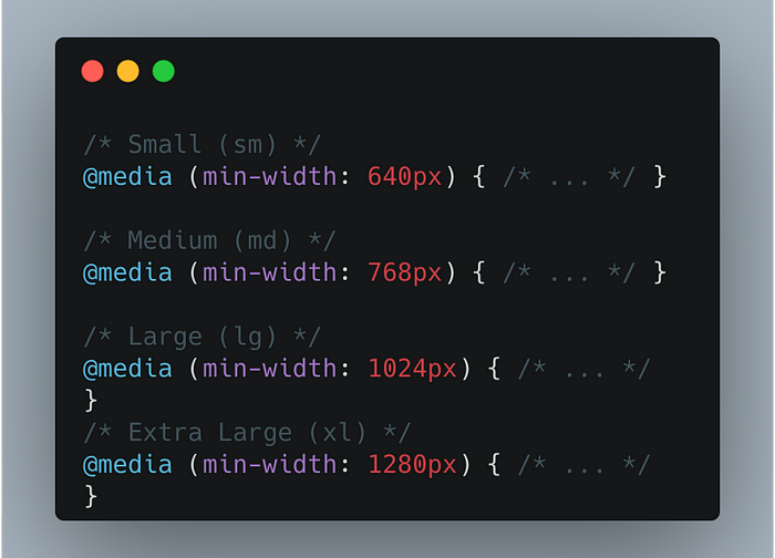
Note: Tailwind uses a mobile-first breakpoint system. According to the docs, this means that “unprefixed utilities (like uppercase) take effect on all screen sizes, while prefixed utilities (like md:uppercase) only take effect at the specified breakpoint and above.”
Look at this small example:
<div class="w-12 h-12 bg-pink-300 sm:bg-green-300 md:bg-red-500 lg:bg-blue-500"></div>
The element will be pink for all screen sizes until there is a breakpoint.
Most often, people get confused with the mobile-first layout system and use the sm: class to style mobile designs, which is incorrect. To target the mobile screen, don’t use any prefixed utility class.
In the same way you can use pseudo-classes such as hover, focus, etc.
<button class="bg-blue-500 p-3 text-white font-bold rounded text-xl hover:text-black hover:bg-blue-700">Click Me</button>Coming back to our navigation bar, you can see a lot of Tailwind utility classes are used in the anchor tag and repeated again and again for all the anchor tags. This makes our HTML look a little bit messy and may become a burden to maintain our classes. To solve this problem, we can extract components.
Extracting components
Tailwind gives an @apply directive to easily extract common utility patterns to CSS component classes. The way we can use this directive is by giving any name to our component (which we will use as a class name in index.html) in public/styles.css and writing down the Tailwind utilities we want to be applied.
Now copy all the classes (except block and inline-block) from our anchor tags and make a component by giving the name anchor.
Here, you can see that the CSS class anchor is being defined by using the @apply directive. To make the changes and use the anchor tag, we have to perform the build process once again:
npm run buildAnd now, we can use this class in our HTML code:
Note that I used the class h-h10. This is not a class provided by Tailwind itself, but it gives us the option to expand and customize some properties on our own. I have given a height of 10vh to the h-h10 class to use it in the nav element. You can customize the height in the theme.height section in tailwind.config.js.
/* tailwind.config.js */theme: {
    height: {
        h10 : "10vh",
        h90: "90vh",
},
In addition to writing component classes directly in your CSS files, you can also add component classes to Tailwind by writing your own plug-in. Check out how you can do it in the official Tailwind documentation.
So far, we have created our navigation bar using only Tailwind CSS utility classes. For the whole project source code, check out the GitHub repo.
Conclusion
Unlike various CSS frameworks out there, Tailwind CSS uses a different approach and provides lots of low-level utility classes with which you can style your website the way you like.
In this article, you have learned how to set up Tailwind CSS in your project, how to use utility classes provided by Tailwind, and how you can create your own component and extract it. To learn Tailwind CSS completely, it is recommended to go through the official documentation and see what classes are provided and how they work.
Thanks for reading this far. I hope you learned something new.

