Build a Custom Paint Flutter App Widget
Wanna create a highly customized user interface with awesome animation? Fear not, Flutter CustomPaint Widget has got you covered
In this article, we will be covering both explicit animation as well as how to work with CustomPaint widget in a flutter.
You can check out the code sample at from my GitHub Repository.
Custom Paint : A widget that provides a canvas on which to draw during the paint phase.
Simply add CustomPaint widget to your widget tree and provide painter to it which is a subclass of CustomPainter abstract class.
Since CustomPainter is an abstract class, it forces us to implement two important methods i.e. paint() and shouldRepaint(). The size spcifies the size of the drawn widget. Let’s get our hands dirty:
The paint() method provides us with two important parameters:
Canvas: Canvas is the area on the screen where we draw our widget. It has various method to draw custom widget. Some of them are:canvas.drawLine(),canvas.drawCircle(),canvas.drawArc(),canvas.drawOval()etc.Size: How big should be the drawing. By default, it takes the size of the wrapper widget i.e the widget wrapping ourCustomPaintwidget. Also, we can provide size parameters inside ourCustomPaintwidget. Since we want to draw a circle so we passed the same value for both the width and height.
The shouldRepaint() method is called whenever CustomPainter needs to be rebuilt. This would get clear when we implement our project.
Now that we understand CustomPainter class, let’s draw something on the canvas. Our goal is to draw a circle with some stroke width.
Let’s see how we do this:
Since we wanna draw a circle, so we used the prebuilt canvas.drawCircle() the method that expects three parameters i.e. center of the circle, radius of the circle and a paint object. We calculated the circle center and radius from size the parameter. The Paint() class provides us various properties like the color of the paint, storkeWidth, style of the paint i.e whether it should be stroked or filled. The current implementation will result in this:

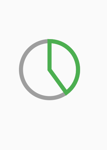
Our next goal is to draw an arc over the same circle that would animate around the stroke. In order to achieve this:
Since we wanna draw an arc, so we used canvas.drawArc() method that expects five parameters i.e. Rect object , startAngle in radian, sweepAngle in radian, useCenter boolean and paint object.
Also, we want to draw arc around the circle, so we used Rect.fromCircle() the method as the first parameter. The second parameter is the start angle which we have applied to -pi/2 as we want to start the angle from top of the circle.
The sweep angle specifies where should the arc end and we have applied 40% of the total angle i.e our arc will draw from -pi/2 to 40% of the total 360 radian.
If useCenter boolean is true, the arc is closed back to the center, forming a circle sector. Otherwise, the arc is not closed, forming a circle segment. And the final argument is our paint object which we are already familiar with.
The current implementation with useCenter set to true will result in this:
But we don’t want that circle sector, so setting it false would result in this:
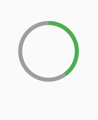
You can tweak the startAngle, endAngle to see the various effects.
Now we are almost close to what we want to achieve. The only part remaining is to animate the progress. In order to do this, we have to use explicit animation i.e. we have to create AnimationController and pass its value down the RingPainter class:
The various things we have done now are:
- Converted our
RingPainterStatelessWidgetto Stateful widget in order to rebuild the UI whenever the value of animation changes. - Created
AnimationController_controller by mixing our_RingPainterStateclass withSingleTickerProviderStateMixinand initilized it withininitState()method. - Started the animation with
_controller.forward() - Added listener to the controller and a
setState((){})is called so that our entire UI rebuilds whenever value of our_controllerchanges. - Now our
MyPainterclass expects three required arguments:progress,defaultColorof the circle stroke and fill color. It is done so in order to pass the various values from outside of this class and to make this component reusable. Note thatshouldRepaint()method is updated such that ourCircleshould only be drawn whenever the progress value differs from the previous value. - Finally passed these three arguments to the
MyPainterclass with progress value being the current value of the animation.
With the current implementation, we are successful to achieve this:
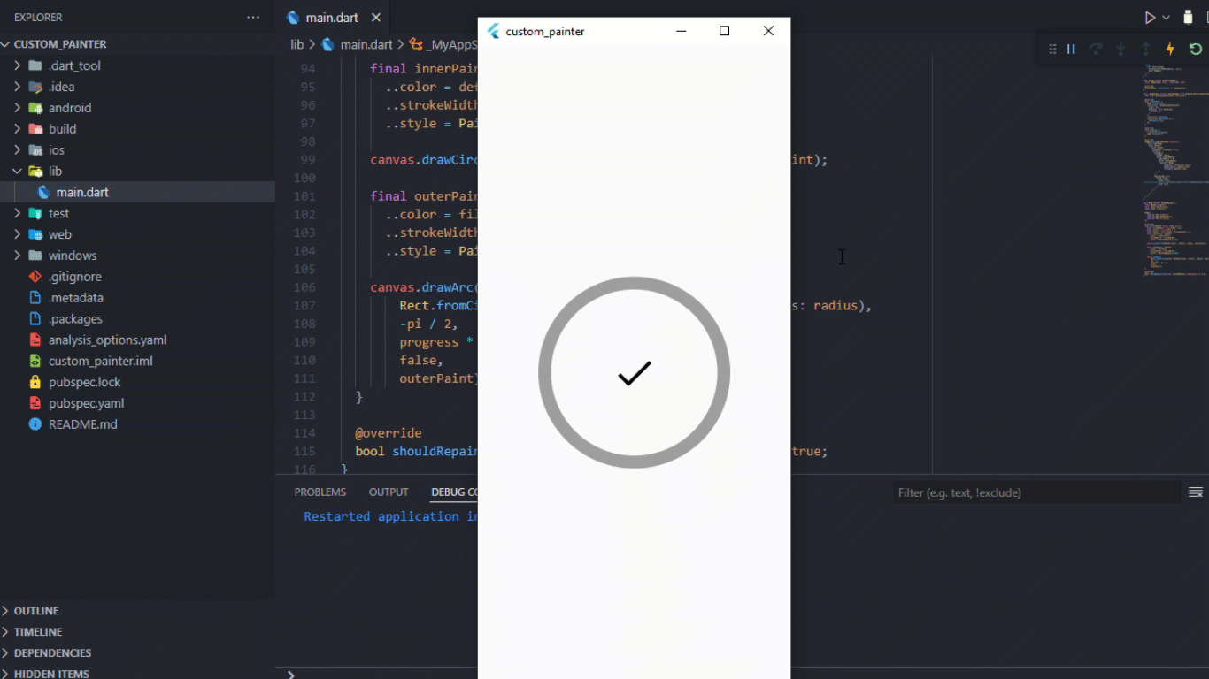
Woah, we are almost to the end! The only thing remaining is to add an Icon at the middle of the circle and change its color depending upon whether the animation is completed or not.
In order to achieve this update your build method like this:
The following implementation would result in this:

So now successfully achieved what we desired.
I hope you have learned something about the CustomPaint widget. Now you can explore on your own to achieve various other effects.
Thanks for reading.

