Build a Custom iOS Segmented Control With SwiftUI
Let’s go further than Apple’s default segmented control

In this article, I’ll be sharing my implementation of a custom SegmentedPicker in SwiftUI. You may ask, “Why go through the pain of implementing this yourself?”
Well, using a SwiftUI picker with .pickerStyle(SegmentedPickerStyle()) is a native way to get segmented control functionality without too much overhead:

But there’s a huge downside: The animations that come with the native picker mean that it’s hard to encapsulate the selection variable without some funny behavior. For example:
See that annoying flickering?
It’s also nearly impossible to customize the appearance of the picker, so to move beyond these constraints, I’ve decided to implement my own segmented control in SwiftUI.
1. Overview
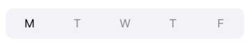
So, here’s what we’re going to build:

We might be tempted to just do something like this:
This is essentially just adding a white RoundedRectangle background to the currently selected index. This works well for simple use cases but doesn't support nice sliding animations between selection transitions.
To make this more elegant, we have three basic elements of the segmented control:
- The rounded rectangle background view
- The text for each item
- The rounded rectangle that denotes the current selection
2. Creating the Container and Items
Let’s define a simple view that just enumerates the items for the segmented control:
This is quite a bit of code. Let’s go over it:
- I always strive to keep view constants like padding, font, and text color nice and organized. This allows me to adjust views without re-diving into the implementation of the view itself. These static constants allow me to easily see and edit minor view details.
- Much like the inputs to the native SwiftUI
Picker, we need some items to display and a@Bindingselection property so that we can propagate state changes to the parent view. - The view itself is simple. It is an
HStackthat places equal-width items horizontally. For each item initems, we call a function to retrieve aTextview element. - The function
getSegmentViewreturns aTextelement with the item name for the specified index. We apply some view modifiers here and make sure to check that the index used is actually within the bounds of our array. Some notable points: We compute whether the current index is selected and use slightly darker text to denote the selection. We use.frame(minWidth: 0, maxWidth: .infinity)so that the tappable frame takes up all of the available space instead of wrapping theTextelement. - We define an
onItemTapmethod. This allows us to change the current selection when we tap on a text element.
Here’s what we get. Not bad! We’re just missing the active element indicator, which is a simple white RoundedRectangle:
3. Active Selection Indicator
The background for the selected element is a RoundedRectangle. To show this rectangle behind our available selections, we wrap our HStack in a ZStack as follows:
We now see a rounded rectangle in the background, but we need to define the size of the rectangle and its relative position depending on the currently active selection.
To define the sizes and offset, we need to somehow get the size of each item. To do this in SwiftUI, we take advantage of PreferenceKey.
3.1 PreferenceKey to get item width
This blog post goes over SwiftUI PreferenceKeys. In short, we can define a PreferenceKey to pass an attribute from a subview to its superview. In our case, we need to pass the size of each text item. Our HStack divides up each item into equal width, so we essentially just need the width of one segment view created in the ForEach loop.
Let’s define a PreferenceKey to retrieve the size. We can then use a neat little trick to get a view's intrinsic size by defining a GeometryReader on the background of the view. We then use a custom ViewModifier to encapsulate all of the operations needed to retrieve the view size and update a binding:
Going through the items:
- This is the
PreferenceKeyto retrieve the size. We define the type of the retrieved value as aCGSize, which contains width and height information. - We define a helper View (
BackgroundGeometryReader) that will serve as the background of our text items. This uses the trick I mentioned earlier — defining aGeometryReaderon the background gives us the intrinsic size of the view. Note that we attach theSizePreferenceKeyand pass to it the view size. - We define
SizeAwareViewModifierto encapsulate all of this logic. It takes as input aBindingforviewSize. This is so that updates in the size can be propagated up the view hierarchy. Note that we attach the backgroundBackgroundGeometryReader, which attaches theSizePreferenceKeyto the view. We then watch for changes in the values of thePreferenceKeyby callingonPreferenceChange. The callback watches for updates inSizePreferenceKeyvalues, then updates the binding accordingly.
Great! Now we just attach the new ViewModifier:
Now that we have access to the intrinsic size of one of the segments, we can build the active selection indicator properly.
3.2 Using view size to create an active selection indicator
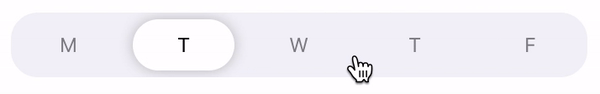
As a recap, this is what our final product should look like. The active selection indicator is the white background that slides with the current selection:
We have two main challenges:
- Defining an appropriate size for the active selection indicator.
- Determining the correct position for the indicator depending on the current selection.
Before, we defined a simple RoundedRectangle in a ZStack as our active segment view. Let's do the following:
- Extract the view as a variable to keep things nice and clean.
- Change the
ZStackalignment to.leading. This means that all the views in theZStackwill be lined up to the leading edge of the frame (rather than the center). This makes calculating the active segment location a lot easier! - Define a method called
computeActiveSegmentHorizontalOffset. This gives us the location of the active segment indicator.
The code should be relatively straightforward, with the exception of computeActiveSegmentHorizontalOffset(). In this method, we use the assumption that our ZStack is aligned to the leading edge (the left edge for most locales). We know the effective horizontal width of each item within our picker to be (self.segmentSize.width + SegmentedPicker.SegmentXPadding / 2). Thus, the value of the offset from the leading edge is just the index selection multiplied by this width.
And that’s it! We now see this result:
To get the complete code, see this gist. Happy coding!

