Change an Application’s Theme Dynamically in Vuetify.js
Build and change themes to fit your app’s different purposes
Vuetify is a Material Design component framework for Vue.js. It provides a lot of features, including the ability to problematically change theme colors in your application. Enabling users to change themes is a good customization feature that gives their app a more personalized feel.
In this article, we will create a Vuetify web application that can dynamically change between themes at runtime and also switch between dark and light modes.
To start, we will create a new Vue.js application. We can do this through the Vue CLI on the terminal:
vue create dynamic-themeOnce that is done, we add Vuetify to our newly created app by changing our current directory to our app folder and running the following command:
vue add vuetifyNow we can run our application on development mode:
yarn serveOpen the application folder with the IDE of your choice and create a new Vue component in the src/components folder named ThemeChangerMenu.vue. This component will just be a standard Vuetify menu that will hold our theme choices and the dark mode switch. All the theme-changing logic will also be contained in this component.
Let’s start by adding the v-menu component to our template. We will use a button with an icon to open the menu and display our theme choices in a v-card component:
Let’s add a switch that will toggle between dark and light modes. To do this, we bind our switch to the $vuetify.theme.dark variable with the v-model directive, which will create a two-way binding with the variable:
To display and test our menu, import ThemeChangerMenu.vue to App.vue and place it inside the v-app-bar component:
We should now have a functional dark mode switch:
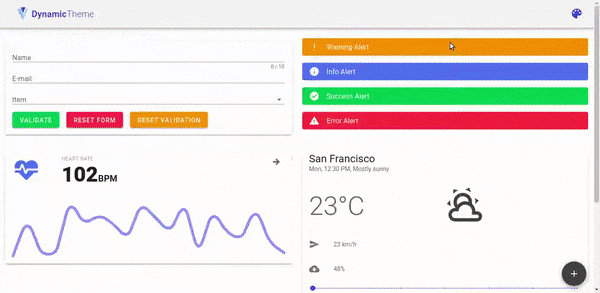
OK! We can now move on to the next part, which is to enable toggling between different predefined theme selections. Create a new data property calledthemes that holds an array of themes:
As you can see from the snippet above, we are storing an array of objects, each with a name and color definitions for dark and light variants of the theme. Then we display them on our menu:
The only thing we’re missing now is the setTheme method, where we’ll place our theme-changing logic:
When a theme is selected from the menu, we close the menu and then iteratively set the theme colors for both the light and dark variants. We also save the name of the theme, which will let us know which theme is currently selected.
Now our theme changer is fully functional:
Well, that’s all for this article. You will find the source code in this repository. Also, check out the demo on GitHub. Please share your comments or suggestions in the comment section.

