Building Design Systems in Flutter
Tips and tricks for implementing a scalable and opinionated design system in Flutter

Nielsen Norman Group (a UX research consultancy) defines a design system as follows:
“A design system is a set of standards to manage design at scale by reducing redundancy while creating a shared language and visual consistency across different pages and channels.”
Unlike the name may imply, design systems’ rules don’t apply to just designers. The real value in a well-constructed and implemented design system is imposing these rules on designers and developers alike, creating consistency that allows both disciplines to focus on higher-level challenges and ignore the tedium of the compositional pieces that form a cohesive app.
You may have heard of design systems like Bootstrap and Ant Design for web, or maybe AirBnB’s Design Language System. Even if they don’t go shouting it from the rooftops, companies successful in design likely have a design system. This allows them to focus on the identity and functionality of their applications without having to think about individual pieces like buttons, banners, text, etc.
As a designer, I don’t want to begin designing a page and have to think about what a button is and exhaustively create specifications for developer consumption. As a developer, I don’t want to be delivered a design and see a button that I have to build from scratch for the tenth time. A good design system and its implemented counterpart (in our case, a Flutter library) solve these problems.
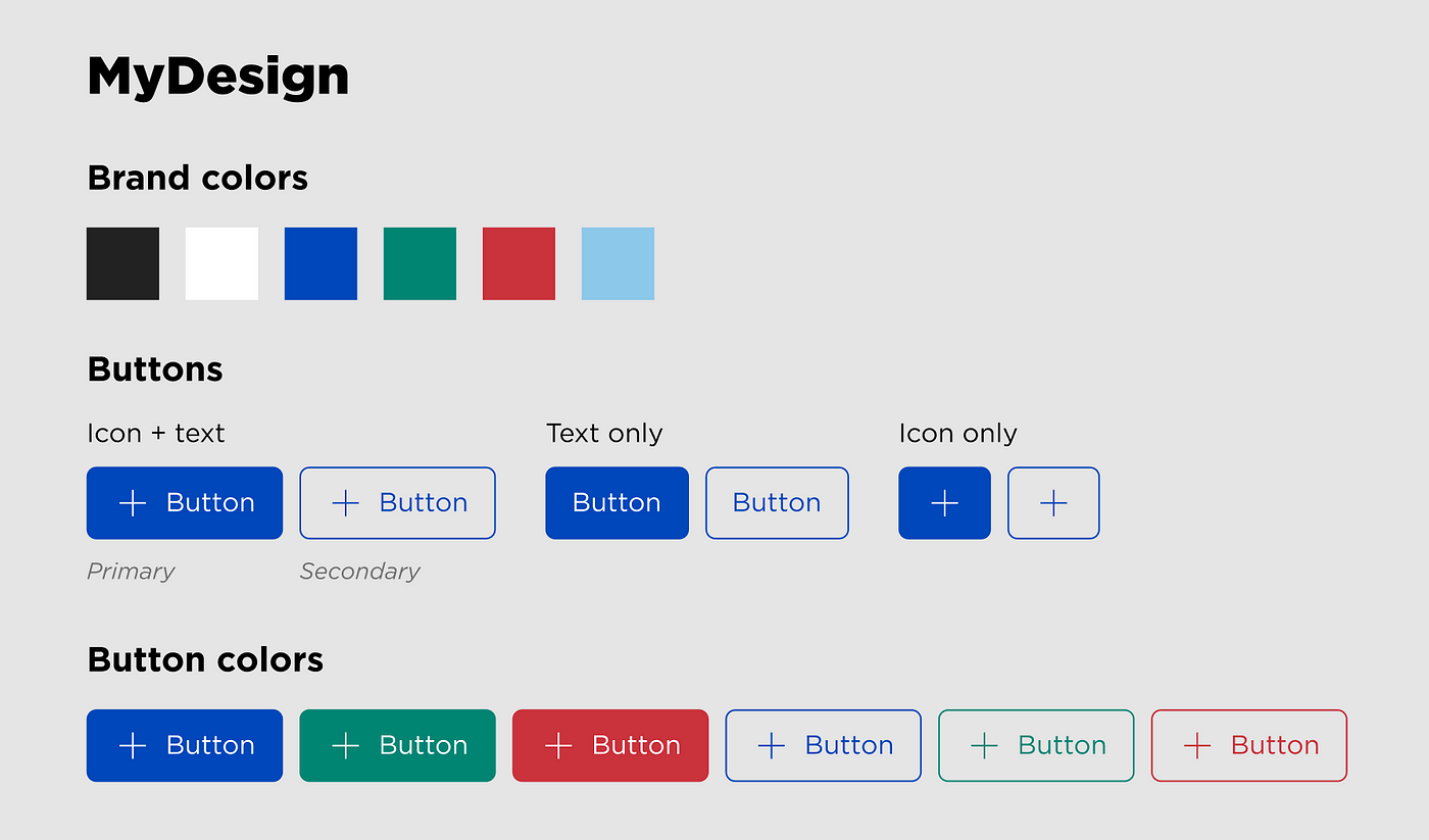
We’ll skip discussing how a design system comes to be, who makes the standards, and how it is documented. Instead, we’ll assume we have a well-defined design system and call it MyDesign. Our job is to build the components of MyDesign in Flutter and have them accurately represent the standards our design system defines. We’ll focus specifically on a set of button widgets:
What follows in this article are tips and tricks that I’ve learned which have led to successful, scalable, and reusable design system implementations.
Naming is Important
As developers, we know semantics are incredibly important for adoption and onboarding. But in the case of design systems, this extends to our friendly neighborhood designers. We are creating a shared language and thus should implement our widgets using that language.
Strive to use the same names for your widgets as designers do when describing components. This ensures that there are no miscommunications when working back and forth between design and implementation. Apply this methodology to the configuration of your widgets as well. If a button has a “leading” and “trailing” icon instead of “left” and “right,” use that same terminology in your widget class’ fields. In the case of MyDesign buttons, we can see they reflect Material filled (elevated) and outlined buttons but are named primary and secondary. Our implementation should respect that naming scheme.
Design system implementations often live independently of the app/s they support. This is a beneficial decoupling so that business logic does not bleed into design implementation, and your library can be reused as a dependency across multiple consuming applications. I’ve found that because of this, a prefix for widgets provided by the design system is also beneficial. MyButton instead of Button helps distinguish which widgets in an application are local and which are not, as well as avoiding name clashes with the many widgets that Flutter and other app dependencies provide.
Define Design Tokens Independently
Design tokens are the “primitives” of a design system — constant values reused throughout components and defined standards. Things like colors, spacings, text stylings, and icons are often included in design systems as “tokens” and are good candidates to define independently from widgets that use them. Material design already does this with the Colors and Icons classes, as well as the textTheme of the default Theme object containing predefined text treatments like body and headline styles.
Use Composition
Flutter is built on aggressive composability, and your design system library should be too. Make use of Flutter’s extensive catalog of Material Design and Cupertino widgets and style them to match your system’s specifications. This abstracts away the styling from all the places your widgets will be used. Avoid repeating code across widgets by creating smaller widgets you can compose into others. With MyDesign buttons, we’ll compose Material’s buttons as a base. In more complex systems, you may have your own base components, which can be composed into multiple others.
Reduce the API Surface
Try to make your widgets as simple as possible. Subscribe to the principle of least knowledge — a widget should only consume exactly the inputs it needs to display and function correctly. This also means your widget can’t be used in unexpected ways.
If you’re using a Material widget and styling it for your design, you likely don’t need all of the configurations the widget allows. Material widgets are intended to be highly configurable, but your widgets may not be. Reduce those parameters!
Some widgets like ElevatedButton are extremely flexible in what can be passed as children (it takes any Widget). In MyDesign, buttons only allow text and icons as children, so we’ll retype our widget’s fields to ensure only valid values are accepted and allow the build function to abstract away the complexities of building the button’s internals.
Use Enums To Enforce Valid Inputs
This tip follows as an extension to the above recommendation. In many cases, a widget’s field types can allow values that don’t fit your design system’s rules. For instance, MyDesign’s buttons only allow a subset of colors from the brand’s palette. Rather than having our widget take aColor type parameter (and thus allowing incorrectly colored buttons), we’ll create an enum that represents and restricts the configuration to those that are allowed.
Before Dart 2.17’s enhanced enums, this would cause the minor annoyance of having to map these enum values back to a valid type in our constructor or build function using a Map or switch case. However, with enhanced enums, we can define enums with final fields connecting each enum value to its represented value.
Inherit Stylings
It’s always a good idea to not hardcode values. We’ve mostly taken care of that by separating out design tokens into constants. However, using MyColors.blue in place of Color(0xff0000ff) throughout our code can still leave our design system needlessly constrained. While our tokens allow a singular place to edit values if the design system needs changes, what if we need an entirely new theme altogether? This is common practice with light and dark theming in applications.
Static constant variables can’t solve for the user’s preference in theme. So, like Material design, use the inheritance of styles from the global Theme by modifying the properties, it comes with or by creating theme extensions.
Use Named Constructors
This may come down to a personal preference, but dart’s named constructors can help reduce boilerplate and enhance the semantics of your widgets.
Looking at our MyDesign primary and secondary buttons, we know that there is reused code in building the internals, but we’ll still need a Material ElevatedButton and OutlineButton respectively. We could create two separate widgets MyPrimaryButton and MySecondaryButton and extract a widget for building the children. Alternatively, we could have a single widget with named constructors, MyButton.primary and MyButton.secondary.
These constructors can set a private field that tells us what to do in our build method. This approach becomes more valuable over multiple widgets as the logic and build method increase complexity (code sharing is easier than coordinating multiple widget communication). It can also be valuable to “group” variants of widgets in this way for semantic purposes. With IDE code completion, typing MyButton. gives a “catalog” of the available variants, a benefit not received through a multi-widget approach.
Conclusion
You can be as strict with your design system as you want. Trusting developers to adhere to spoken or written rules may be enough in many circumstances. But to build widgets that take advantage of shared terminology with designers and tightly enforce the system’s rules can lead to speedier design-to-dev handoff and easier onboarding for future developers.
Additional reading
Design systems being flexible across devices is extremely important. Check out my article on responsive layout in Flutter.
If you’d like to support my writing and get full Medium access, consider joining using my referral link. A portion of your subscription goes to me and creating more articles like this!

