Animated Floating Action Button With More Options!

Hello, developers! Welcome to this tutorial. Today I’m gonna teach you how to make an animated FAB (Floating Action Button) that displays more options when clicked. Excited?
First, make an Android blank project. I hope you already know how to create one.
Make sure you have added the Android Design dependency because the FAB is included in this library. Copy and paste it into your project.
implementation 'com.android.support:design:28.0.0'If you don’t know how android data binding works and what data binding is, I urge you to go and learn Android Data Binding.
For this project, I’ll tell you little about data binding. In data binding, you don’t need to write findViewById anymore. You can store your XML in one variable and use it throughout your activity. Make sense?
To enable data Binding, include the following lines of code in your build.gradle (app level).
dataBinding{
    enabled true
}
After starting, your activity should look like this:

Next, wrap it up in the <layout> tag. Don’t panic; that’s how data binding works!

coordinatorLayout is a super-powered FrameLayout. We use it if we want to interact with more than one child view or top-level decor/chrome layout.
Let’s add LinearLayout inside coordinatorLayout. Add the following code.
<LinearLayout
    android:gravity="center_horizontal"
    android:layout_gravity="bottom|end|right"
    android:orientation="vertical"
    android:layout_width="wrap_content"
    android:layout_height="wrap_content">
</LinearLayout>
Next, add the Floating Action Button (FAB) inside this linear layout.
<android.support.design.widget.FloatingActionButton
    android:id="@+id/fabAdd"
    android:layout_width="wrap_content"
    android:layout_height="wrap_content"
    android:layout_marginLeft="18dp"
    android:layout_marginTop="10dp"
    android:layout_marginRight="18dp"
    android:layout_marginBottom="18dp"
    app:fabSize="normal"
    app:rippleColor="@color/white" />
Add these in your colors.xml.
<color name="white">#ffff</color>
<color name="grey_20">#cccccc</color>
<color name="grey_80">#37474F</color>
Add three icons that will show on buttons. I’m using Android material icons. You can use your own icons too, but if you want to stick with me, add my choice.
Now include the add icon in your floating action button. Your code should look like this:
<android.support.design.widget.FloatingActionButton
    android:id="@+id/fabAdd"
    android:layout_width="wrap_content"
    android:layout_height="wrap_content"
    android:layout_marginLeft="18dp"
    android:layout_marginTop="10dp"
    android:layout_marginRight="18dp"
    android:layout_marginBottom="18dp"
    android:src="@drawable/ic_add"  //added add icon
    app:fabSize="normal"
    app:rippleColor="@color/white" />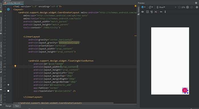
Let’s animate our FAB first:
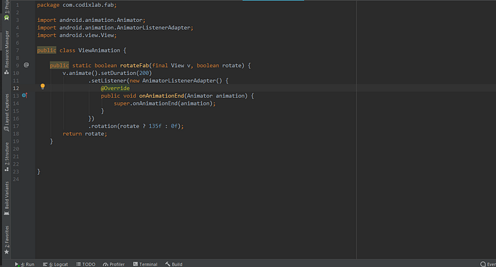
Make an animator class named ViewAnimation.java. We will add all our animation methods to this class.
Add this method in the animation class:
public static boolean rotateFab(final View v, boolean rotate) {
    v.animate().setDuration(200)
            .setListener(new AnimatorListenerAdapter() {
                @Override
                public void onAnimationEnd(Animator animation) {
                    super.onAnimationEnd(animation);
                }
            })
            .rotation(rotate ? 135f : 0f);
    return rotate;
}
Your animation class should look like this:
ViewAnimation.javaNow, let’s move to the activity class and implement our animation on the FAB.
Your activity code should look like this:
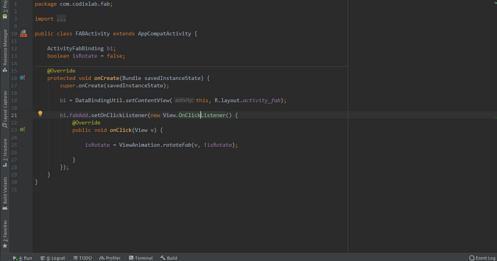
Don’t panic. Let me elaborate on each step!
ActivityFabBinding: This is for data binding. You first have to write Activity, then its name, (in my case, I named it Fab) then add binding.
isRotate: This is a boolean that will work according to the rotate condition. If true, it means our FAB is rotated and if false, it’s not.
bi: I stored the whole XML in this variable using data binding methods.
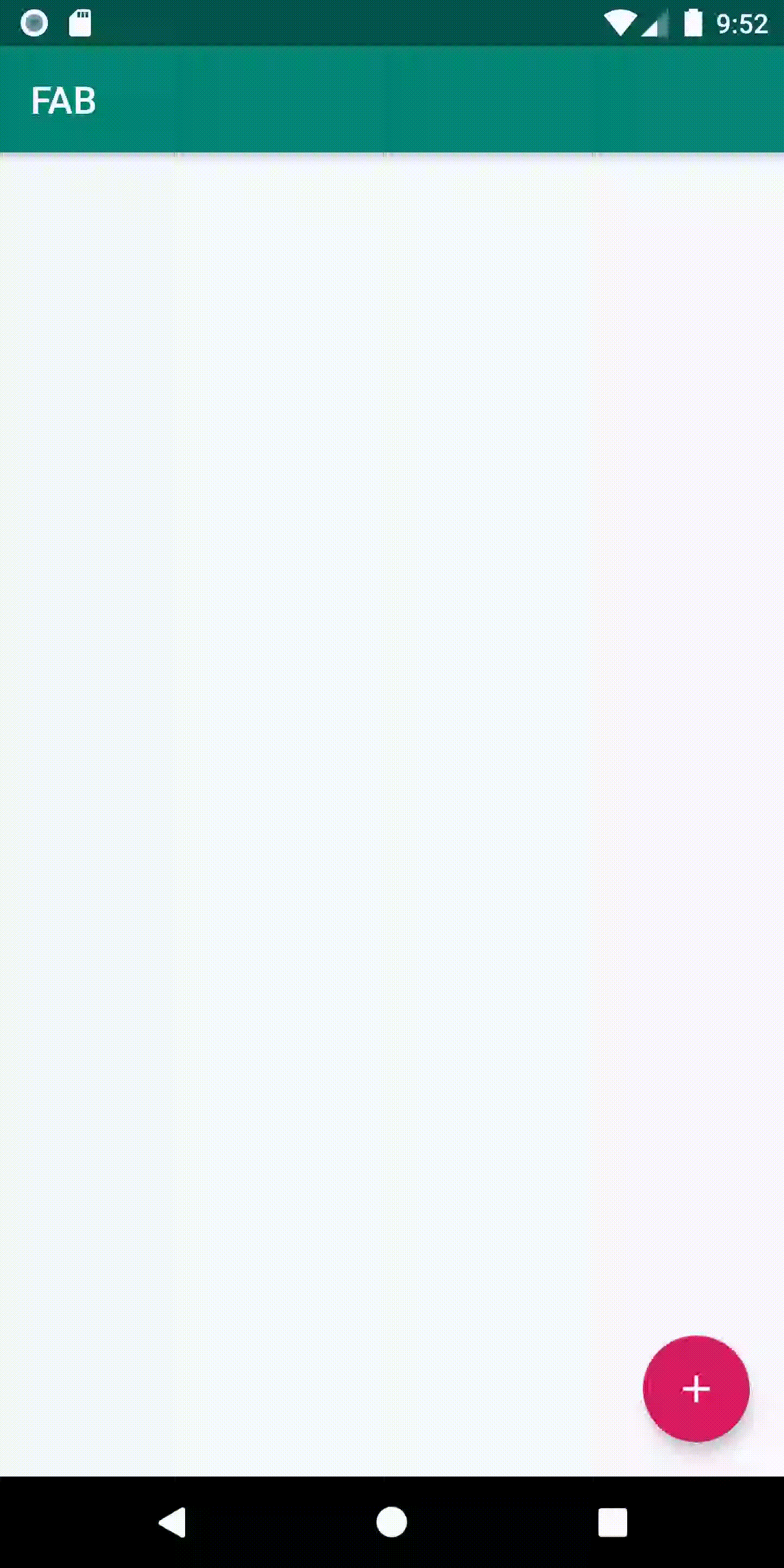
Run the app and you will see a beautiful, smooth animation of the FAB!
Love it?
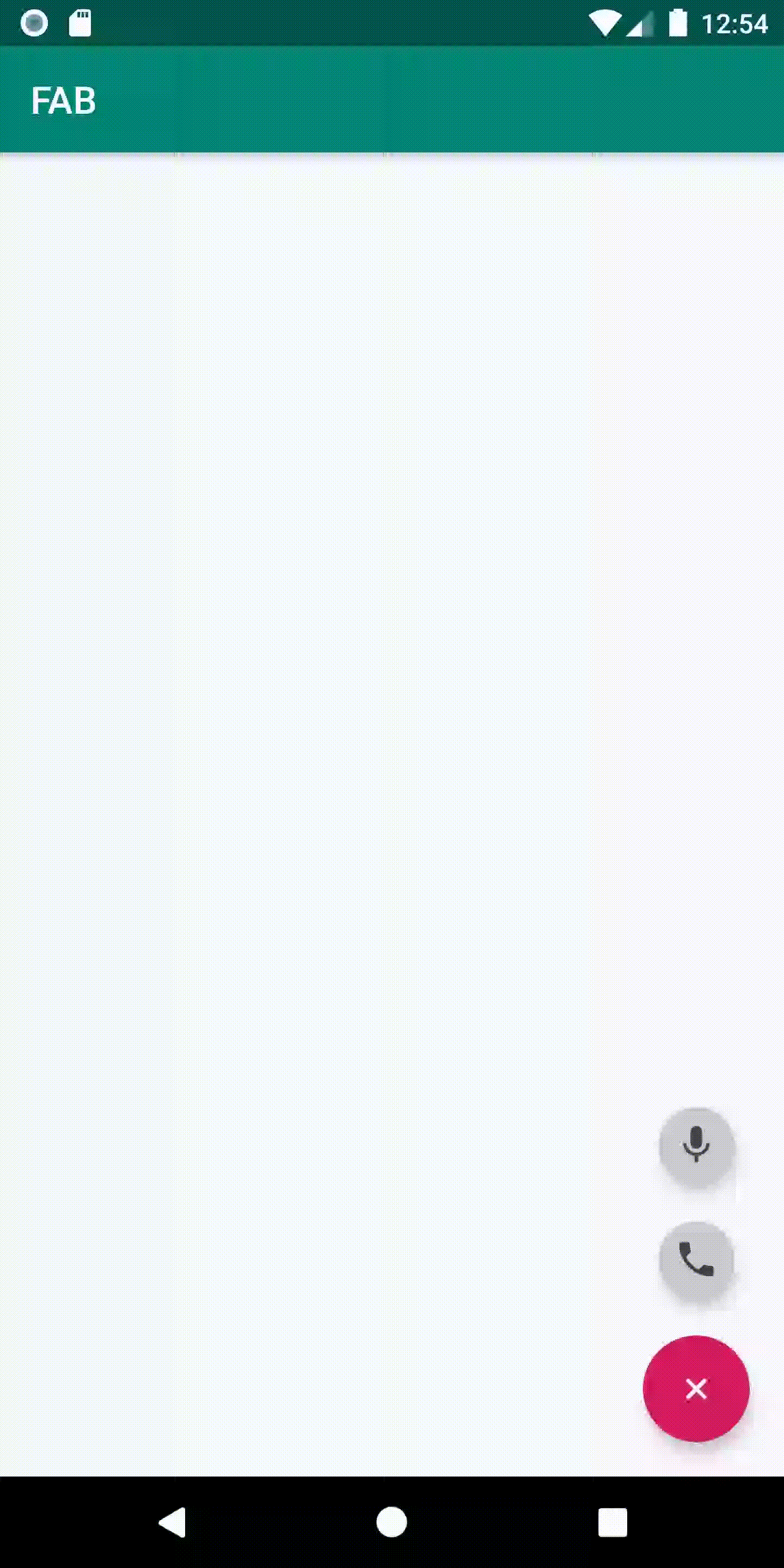
Now it’s time to add child FAB buttons that will populate upward when you click add FAB button. Like this:
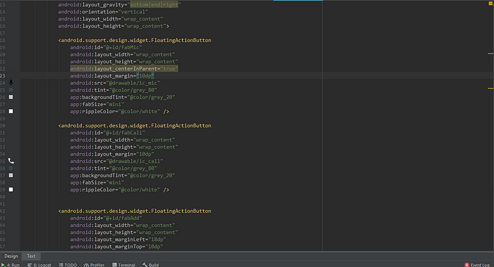
To achieve this, you have to open your main XML to where we added our FAB button earlier and add the following lines of code under it.
<android.support.design.widget.FloatingActionButton
    android:id="@+id/fabMic"
    android:layout_width="wrap_content"
    android:layout_height="wrap_content"
    android:layout_centerInParent="true"
    android:layout_margin="10dp"
    android:src="@drawable/ic_mic"
    android:tint="@color/grey_80"
    app:backgroundTint="@color/grey_20"
    app:fabSize="mini"
    app:rippleColor="@color/white" />

<android.support.design.widget.FloatingActionButton
    android:id="@+id/fabCall"
    android:layout_width="wrap_content"
    android:layout_height="wrap_content"
    android:layout_margin="10dp"
    android:src="@drawable/ic_call"
    android:tint="@color/grey_80"
    app:backgroundTint="@color/grey_20"
    app:fabSize="mini"
    app:rippleColor="@color/white" />
Both are child FAB buttons.
You can see fabSize is mini. Your code should look like this:
Now we have to implement the open and close functionality. Let’s add some new functions in our ViewAnimation.java file to get the required result.
public static void showIn(final View v) {
    v.setVisibility(View.VISIBLE);
    v.setAlpha(0f);
    v.setTranslationY(v.getHeight());
    v.animate()
            .setDuration(200)
            .translationY(0)
            .setListener(new AnimatorListenerAdapter() {
                @Override
                public void onAnimationEnd(Animator animation) {
                    super.onAnimationEnd(animation);
                }
            })
            .alpha(1f)
            .start();
}
public static void showOut(final View v) {
    v.setVisibility(View.VISIBLE);
    v.setAlpha(1f);
    v.setTranslationY(0);
    v.animate()
            .setDuration(200)
            .translationY(v.getHeight())
            .setListener(new AnimatorListenerAdapter() {
                @Override
                public void onAnimationEnd(Animator animation) {
                    v.setVisibility(View.GONE);
                    super.onAnimationEnd(animation);
                }
            }).alpha(0f)
            .start();
}

public static void init(final View v) {
    v.setVisibility(View.GONE);
    v.setTranslationY(v.getHeight());
    v.setAlpha(0f);
}
These three functions help us get smooth animations for our mini FABs.
showIn(): This method is responsible for pushing our FABs inside when we click.
showOut(): This method is responsible for pushing our FABs outside.
init(): This method is responsible for hiding our buttons when the app started.
Just run the app for now!
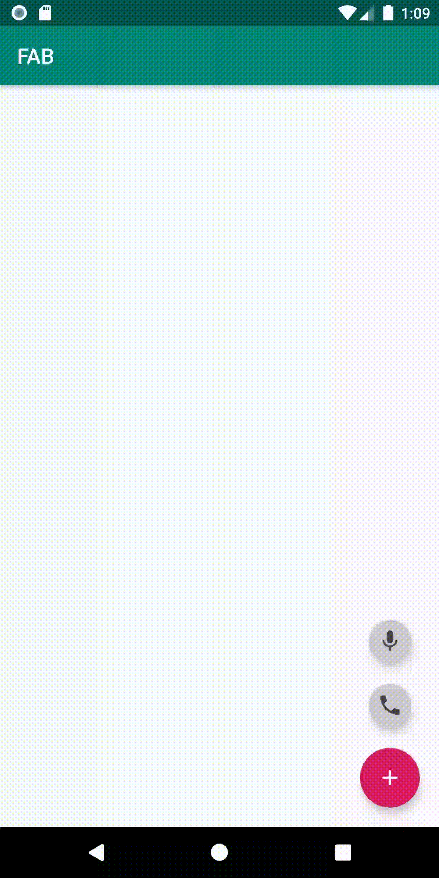
Nothing happens when we run it! Let’s implement the functionality step by step.
First, let’s hide our mini-FABs when our app starts. Add the following lines of code in your onCreate method and run the app.
ViewAnimation.init(bi.fabMic);
ViewAnimation.init(bi.fabCall);
Now it’s time to pop them up at the click of our main FAB button.
Add these lines in your onCreate method.
bi.fabAdd.setOnClickListener(new View.OnClickListener() {
    @Override
    public void onClick(View v) {
        isRotate = ViewAnimation.rotateFab(v, !isRotate);
        if(isRotate){
            ViewAnimation.showIn(bi.fabCall);
            ViewAnimation.showIn(bi.fabMic);
        }else{
            ViewAnimation.showOut(bi.fabCall);
            ViewAnimation.showOut(bi.fabMic);
        }

    }
});
Run the app and see the magic!

Let's add click listeners to our mini-FABs!
bi.fabCall.setOnClickListener(new View.OnClickListener() {
    @Override
    public void onClick(View v) {
        Toast.makeText(FABActivity.this, "Calling", Toast.LENGTH_SHORT).show();
    }
});

bi.fabMic.setOnClickListener(new View.OnClickListener() {
    @Override
    public void onClick(View v) {

        Toast.makeText(FABActivity.this, "mic", Toast.LENGTH_SHORT).show();
    }
});
Now run the app again:

Hope you liked the tutorial! Thanks for reading! :-) Happy Coding!
Follow CodixLab for more tech knowledge.
Found this Article useful? Follow me Mustufa Ansari on medium. Check out my most read articles below.

