Angular Material Tricks — Autocomplete With Multiple Input Fields
Yes, you can make an autocomplete drop-down work for two inputs
This is going to be a not-so-short blog post about how I tweaked Angular Material’s autocomplete component for getting results based on two input boxes instead of a single one.
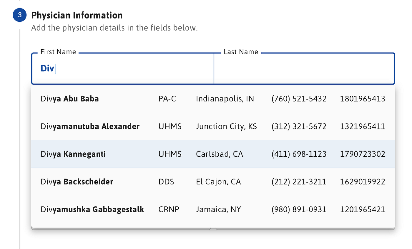
I am developing web applications for the healthcare industry at work. In my current assignment, I was asked to provide a physician search functionality. The requirement said the users of the application can search for a physician by their first name and last name with auto-completion support.
It looked like a simple task. We had opted-in to using the excellent Angular Material framework, and I had this great idea to use the autocomplete component from the Material library.
I was going to provide a text box. The user was going to type the physician’s name, and voila, an autocomplete dropdown was going to be displayed with the physician list, right?
Wrong.
The Problem
I was using a relational database that stored the physician’s name in two columns, called First_Name and Last_Name. The requirement was asking me to let the user search with first name, last name, or both of them, at the same time.
With a single text box, there was no way for me to know whether the text entered was the first name or the last name of the physician. I could run an or query, but this was returning way too many results.
It was getting even worse if the user typed more than one name into the text box due to the different search combinations. It didn’t look promising and I was kind of stuck.
The Solution
The other idea that came to my mind was to split the single full name text box into two. I could retrieve the user input from separate first name and last name text boxes. Separating the text-boxes would let me identify the correct column or columns to query.
When I checked the Angular Material autocomplete component, it looked like it was designed for a single input field. There wasn’t even a single reference implementation for multiple input fields, nobody seemed to try this.
Nevertheless, I decided to give it a try without much hope. And below is my solution, which worked!
We have to answer two questions to make this work:
- How to display an autocomplete drop-down box that’s designed for a single text box for two text boxes?
- How to trigger the autocomplete event when any one of these text boxes has a new value?
Display a Single Autocomplete Drop-down for Two Text Boxes
Let’s look into the below Html line-by-line to understand what’s going on.
Line 1
On line 1, we have a bootstrap row div which has a matAutocompleteOrigin attribute. We also have a template reference variable named #origin.
The matAutoCompleteOrigin attribute makes the div a target candidate for rendering our autocomplete drop-down box. We will use the #origin variable to bind the autocomplete component to this div in the upcoming lines.
Line 5
On line 5, we are defining our first name input box. With [matAutocomplete]=”auto” we are binding the autocomplete component to this input box. [matAutocompleteConnectedTo]=”origin” tells the browser to render the autocomplete drop-down relative to div we had defined on line 1.
Line 6
On line 6, we are defining our autocomplete component with a template reference named #auto, which we referenced on line 5.
We are also binding the optionSelected event of the autocomplete to the setFormData function to be able to customize the default behavior. We will talk about the setFormData function in the second section.
Lines 7–11
Lines 7–11 define our options that are going to be displayed in the autocomplete drop-down. We are looping on a physicians observable with an async pipe and displaying the first name and last name of the physician.
Lines 18–25
Lines 18–25 do the same thing for the last name input box, this doesn’t require additional explanation.
Trigger the Same Autocomplete Event for Two Separate Input Boxes
In this section, we’ll be talking about how to trigger the physician search for the same autocomplete drop-down with changes coming from two different input boxes.
Let’s look into the code line-by-line.
Lines 18–21
On lines 18–21, on initialization of the PhysicianInfoComponent, we are making two function calls setupPhysicianControls() and setupPhysiciansObservable().
The first call sets up the reactive form with the required FormControl objects that we are referencing in our template. The second call is for setting up the physicians observable, which is being used by the autocomplete component to display the options list.
Lines 23–41
As setting up the form controls is trivial, our focus will be on the setupPhysiciansObservable method which is on lines 23 to 41.
The Angular FormControl object provides a valueChanges property, which is an observable and emits the value of the form control every time its value changes.
In our case, we have two form controls to deal with, for first name and last name, respectively. We have to trigger a new physician search to our back end every time one of these form controls changes value.
The merge operator comes in handy in these kinds of scenarios which merges two observables to a single one.
Line 24
On line 24 we are using merge for merging first name and last name valueChanges observables.
Line 26
Line 26 delays the emission of the new value for 300ms to give the user time to complete their search criteria before triggering a search.
Lines 27–32
On lines 27–32, we are changing the emitted object from the value of a single input box to the values of both first name and last name input boxes. This is because our requirement is to let the user search both, with first name and last name at the same time.
Line 33
Line 33 limits the search term to be more than three characters. This way, we don’t trigger a search for terms shorter than three letters.
Lines 35–39
Lines 35–39 make the back-end request and map the response object to response.body which is a physician array, which concludes the setup of our physician observable.
setFormData Method
The second important function we have to look into is the setFormData method I mentioned in section one.
Especially lines 74–75 are important in this method because they override the default behavior of the autocomplete component when an option item is selected from the drop-down.
In these lines, instead of letting the autocomplete component set the values for first name and last name form controls, we are manually setting these values.
Two lines are pretty straightforward but the trick is to make the setValue calls with the {emitEvent: false} option.
By default, form controls emit a valueChanges event when the value changes. This is irrespective of the user making the change on the form or you are making the change in your code.
By using {emitEvent: false}, we are preventing a valueChanges event from being fired, otherwise this would cause a second back-end call via our physicians observable.
This concludes the post. I hope it helps in your daily endeavors.
Happy coding!
