A Comprehensive Guide to Flexbox
Learn Flexbox with some humor
As a good frontend developer, you can’t overlook Flexbox in 2020. It’s a CSS module that helps you make your website responsive with ease.
However, the application of Flexbox can be quite confusing if you don’t grasp the main principles.
I’ll introduce you to all off its important quirks and properties. There will also be three challenges, in which I’ll demonstrate the proper usage of individual properties. Feel free to try them on your own in this code snippet in CodePen.
Also, a big thank you to Bernar May for providing apt pictures of every Flexbox property!
Inevitable Basics
Flexbox involves its own set of properties you can use. It’s important to learn the main principles of how it works.
For starting out, let’s take a look at this figure:

When applying a Flexbox to your app, there’s always a flex container, which is the parent element of the flex items.
You should also distinguish between the main axis and cross axis. The main axis of a flex container is the primary axis along which flex items are laid out. The axis perpendicular to the main axis is called the cross axis. Its direction depends on the main axis direction.
Note: The main axis is not necessarily horizontal; it depends on the flex-direction property (see below).
Now, with this knowledge, let’s dive into specific properties you can use. For demonstration purposes, I’ll use a layout of boxes from the code snippet in CodePen.
The ‘display’ Property
Before you apply Flexbox, the parent component (the flex container) needs to have thedisplay property set to flex or inline-flex.
What’s the difference?
There’s absolutely none when it comes to the effect on flex items. display: inline-flex makes the flex container display inline. A similar comparison can be made between display: inline-block and display: block.
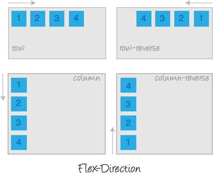
‘flex-direction’
This property establishes the main axis, thus defining the direction flex items are placed in the flex container. Flexbox is (aside from optional wrapping) a single-direction layout concept. Think of flex items as primarily laying out either in horizontal rows or vertical columns.
flex-direction offers the following four values you can set to the flex container: row, column, row-reverse, and column-reverse.
The aptest example, how each value affects the view, is show in this picture:
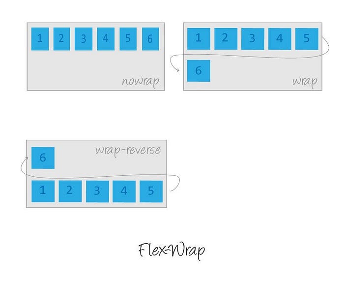
‘flex-wrap’
The flex-wrap property is for setting the flex container to wrap or not to wrap items in one line. Available values are wrap, no-wrap, and wrap-reverse. By default, flex items will try to wrap into one line.
Practice Exercise #1
Challenge
Let’s demonstrate flex-direction and flex-wrap in the following example, and then we’ll move on. I want to have boxes in a row, and they should wrap if needed, like so:
Solution
Here’s the code from the flex container:
.flex-container {
  height: 200px;
  display: flex;
  flex-direction: row;
  flex-wrap: wrap;
}
Tip: You can also use theflex-flow property, which is just a shorthand of flex-direction and flex-wrap, and they, together, define the flex container’s main and cross axes.
flex-flow: <‘flex-direction’> || <‘flex-wrap’>So we could apply it in the following way:
.flex-container {
  height: 200px;
  display: flex;
  flex-flow: row wrap;
}
‘justify-content’
This defines the alignment along the main axis. It helps distribute extra free space leftover when either all the flex items on a line are inflexible — or are flexible but have reached their maximum size. It also exerts some control over the alignment of items when they overflow the line.
In this property, there are five values available. The following picture depicts the behavior of each value:

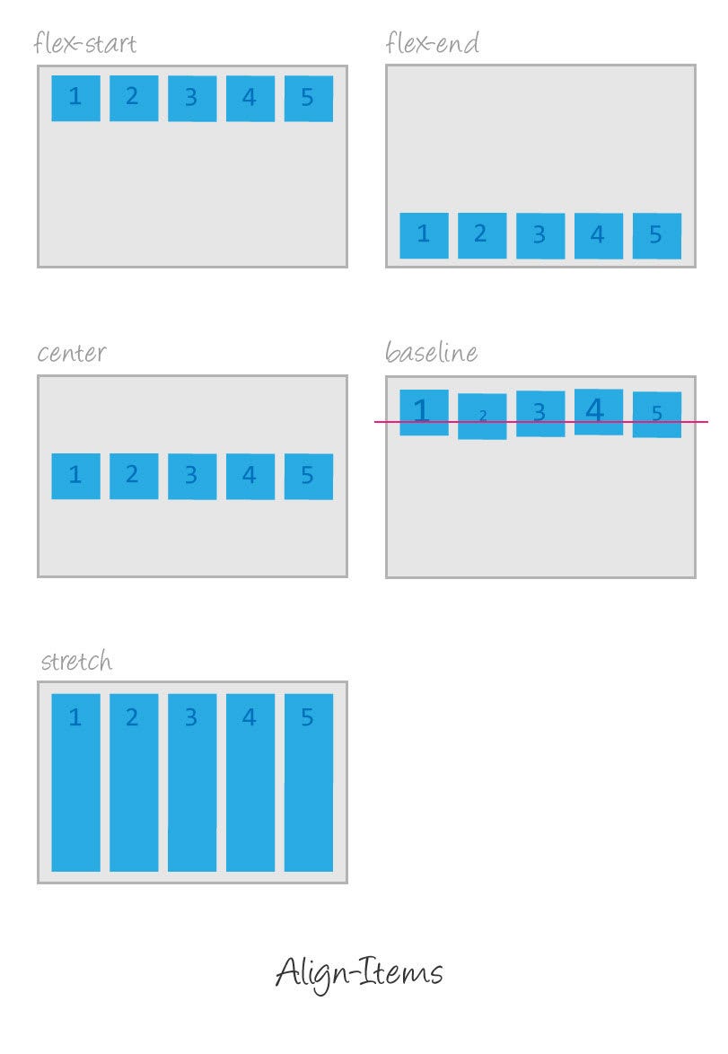
‘align-items’
This property is very similar to justify-content — except it aligns items on the cross axis and not the main axis. Here’s a picture with all available values:
‘align-self’
This allows the default alignment (or the one specified by align-items) to be overridden for individual flex items. Available values are the same as in the align-items property:

Practice Exercise #2
Challenge
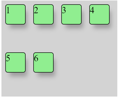
The theory I explain above seems to be obvious in terms of how items should behave. However, if you want to avoid unexpected behavior, you have to observe a few principles in Flexbox. Let’s demonstrate it in the example.
We want to position our green boxes in the following way:
And here’s our HTML structure:
Solution
According to the theory, we can use justify-content and align-items on the flex-container, so we’ll center it to the middle along the main and cross axes:
.flex-container {
  display: flex;
  justify-content: center;
  align-items: center;
}
But this isn’t enough.
In this case, the flex items are aligned to the center only along the main axis because the flex container and wrapper are adiv element, which is set to width: 100% by default.
Note: Keep in mind that when aligning, flex-container must have always width and height defined.
Now the only thing we need is to align the boxes with the first-column class at the top and the boxes with thethird-column class at the bottom. We can accomplish that with thealign-self property:
.first-column {
  align-self: flex-start;
}.third-column {
  align-self: flex-end;
}
‘flex-grow’ and ‘flex-shrink’
With the flex-grow property, you can handle cases when you need some flex items to grow. It accepts a unitless value that serves as a proportion. It controls how much of the available space inside of the flex-container that the item should take.
If all items have flex-grow: 1, the remaining space in the flex-container will be distributed equally to all children. If one of the children has a value of 2, the remaining space would take up twice as much space as the others (or it’ll try to, at least).

Note: Negative numbers are invalid.
flex-shrink is just the opposite of flex-grow. You can define a flex-item to shrink if necessary, so the item will take less space then others.
‘flex-basis’
This property defines the size of the flex-item along the main axis of the flex-container before the remaining space is distributed. It can be a length (e.g. 20%, 5rem, etc.), auto, or content.
The auto keyword means “look at my width or height property.” The extra space will be distributed based on its flex-grow value.
The content keyword means “size is based on the item’s content.”
If set to 0, the extra space around content isn’t factored in. Check this graphic.
‘flex’
This property is just a shorthand of the previous three properties combined. The second and third parameters (flex-shrink and flex-basis) are optional. The default is flex: 0 1 auto, but if you set it with a single number value, it’s like <number> 1 0.
Note: It’s recommended you use this shorthand property rather than set the individual properties. The shorthand sets the other values intelligently.
Practice Exercise #3
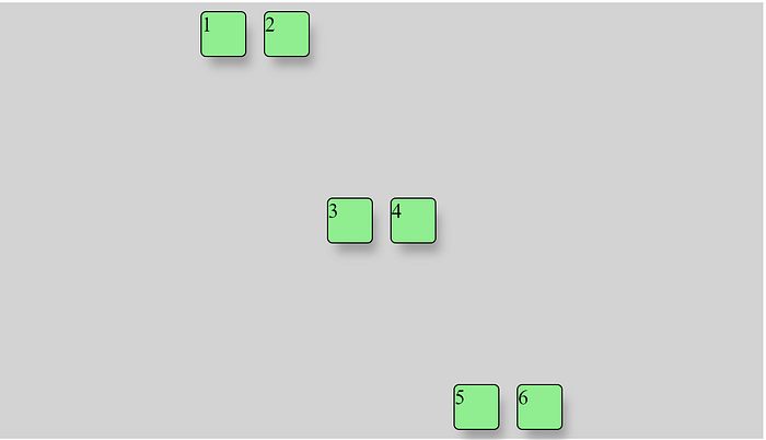
This challenge is maybe the most useful and the most difficult at the same time.
Challenge
Let’s say we can use Flexbox only, and we want our green boxes to have three rows with two columns. So it should look like this:
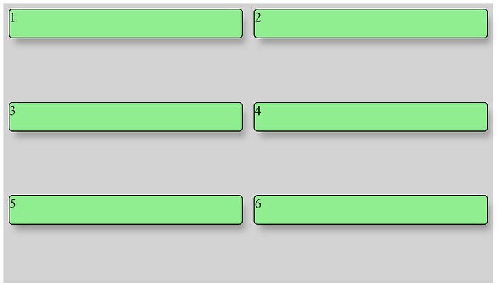
Solution
As you can see from the picture, we first need to tell flex-container to wrap items. This we already know:
.flex-container: {
  display: flex;
  flex-wrap: wrap;
}
And now the funny part. With knowledge about flex properties, we can solve it with one line of code:
.flex-item {
  flex: 1 0 50%;
}
1 is for flex-grow, 0 is for flex-shrink, and 50% is for flex-basis. You might think this will always work — but there’s a catch.
In flex-basis, you need to count including the item’s border and margin (from both sides!), because they’re extending its width.
Here’s a code example of how it can look:
Conclusion
With knowledge of Flexbox, I’m pretty sure you’ll become a better front-end developer, mostly in terms of styling components. Knowledge of CSS is underestimated in most projects, but your app won’t attract the eyes of potential customers if it looks awful and can’t be used on mobile screens.
I’d say the fluent responsiveness of apps is crucial these days.
If you want to position a single component, maybe Flexbox would be an overkill for your needs. For that case, you can use the position property, which I explain here:
Thank you for reading!

