Member-only story
6 Ways To Configure Global Styles for Storybook
A detailed guide for better use of Storybook

Storybook is an open source tool for building UI components and pages in isolation. This allows us to work on one component at a time. It streamlines UI development, testing, and documentation.
We have written about Storybook and its features — zero-configuration setup, dynamic component editing, multiple Storybook composition, and documentation improvement.
It is a common task to configure global styles for Storybook, such as background color, color, font family, and font sizes. In this article, we use setting the background color as an example to accomplish the task in 6 different ways. To differentiate the solutions, each way sets a unique background color. In the process, we see which method takes the higher precedence.
- Pink background: Use stylesheet in
preview-head.html. - Chocolate background: Configure
previewHeadinmain.js. - Yellow background: Import stylesheet in
preview.js. - Purple background: Configure
previewBodyinmain.js. - Beige background: Set style inside
preview-body.html. - aquamarine background: Configure decorator in
preview.js.
Let’s go into the details on how each method works.
Set up Storybook in Create React Environment
We use Create React App as a base to explore Storybook. The following command creates a React project:
npx create-react-app react-storybook
cd react-storybook
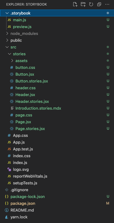
Type the command, npx sb init, and Storybook is installed.

Type the command, npm run storybook, and the example Storybook runs at http://localhost:6006.

By default, the background color is white. We want to configure it to a different…

